
Tables in Python with Great Tables
Tables in Python with Great Tables - Rich Iannone, Michael Chow Resources mentioned in the workshop: - Workshop GitHub Repository: https://github.com/rich-iannone/great-tables-mini-workshop - Great Tables https://posit-dev.github.io/great-tables/articles/intro.html - {reactable-py} https://github.com/machow/reactable-py - Save a gt table as a file https://gt.rstudio.com/reference/gtsave.html - {gto} Insert gt tables into Word documents https://gsk-biostatistics.github.io/gto/ - GT.save https://posit-dev.github.io/great-tables/reference/GT.save.html - define_units https://posit-dev.github.io/great-tables/reference/define_units.html#great_tables.define_units - Posit Tables Contest 2024 winners: https://posit.co/blog/2024-table-contest-winners/ Editor's note: During this workshop, several interruptions from an unwanted and disruptive intruder (commonly referred to as a "Zoom bomber") occurred. We removed those instances from the recording, however that causes a few of the workshop sections to appear disjointed. We apologize for the inconvenience. Workshop recorded as part of the 2024 R/Pharma Workshop Series


image: thumbnail.jpg
Transcript#
This transcript was generated automatically and may contain errors.
Sounds great. Thanks Harvey. Rich, do you want to introduce yourself? Yeah, my name is Rich. I work at Posit along with Michael and we're working on essentially some new Python projects, open source projects, and also I'm doing some R stuff as well at the same time. So it's really good. I've been at Posit for quite a while and really dig in doing the open source tooling stuff. Yeah, nice. And I'm Michael. I work with Rich on Great Tables. I've only been styling tables for a year now, but it just continuously blows my mind. So I'm really excited to help with this workshop and Great Tables in general. So I think, Rich, correct me, I think the format is I'll do a quick overview of Great Tables. Yeah. And then Rich will jump in and do a bunch of live coding and reviewing different Great Tables examples that everyone can walk through. That's the plan. Yeah. Nice.
All right. So let me pull up these slides and share my screen. Okay. Here we go. Okay. So I think the key to Great Tables is there are sort of three big activities. There's structuring, formatting, and styling. And this is the way that we can go from a regular table to a report-ready table. And what I mean by that is you might, if you work with data a lot and you're analyzing data a lot, you might be used to this table. This is a raw polars data frame. So this table is more the guts of the data. You'll notice there are underscores in the column names. There's this little blurb about the shape and then the column types here. So this is really great. If you're like a table mechanic, you're analyzing data, this is really helpful because you need to know the exact names of the columns. You don't really want uppercase all in there or spaces. It's just easier to refer to things with underscores. And you might want the raw data too. So you don't necessarily want commas all up in your numbers. You just want to kind of see the raw data so you can analyze it and work with it.
So we mean less of that and more of tables like this. So this is a table of fictional coffee sales for over the year for a fictitious coffee company. And this shows a little bit more structure, formatting, and styling. So for structure, we have these titles. We've cleaned up the numbers. We've added some color and some of these nice bars. So we mean less of this kind of raw table and more of these formatted, presentation-ready tables for people to read and pull insights from.
How people make tables today
And so one big question is how do people make tables today? If you're doing data analysis, say in Python, you're probably dealing a lot with raw data frames. But then when it comes to presenting tables, oftentimes what we've seen is people will pull it into a tool like Excel and then back into their reporting tool. And so this is a bit challenging because this sort of breaks your workflow. It pulls you out of Python and into another tool. And the copying itself can be a bit error-prone. So a little bit broken and error-prone. The goal with Great Tables is to preserve the visualization step. So by having this, you don't have to pull it into Excel, but can keep your data in Python and do everything you need to to get a publication-ready table out.
All right. So just to summarize, Great Tables is all about creating display tables in Python. It's not the only approach, but we've tried to make it comprehensive. It's actively developed by Rich and I. And Rich, as a person obsessed with table display, I feel like has tried to anticipate more table situations than I could ever dream of. And if you're used to GT in R, Great Tables is a port of GT to Python. So hopefully the interface feels pretty familiar.
Great Tables as a framework
All right. So really quickly, I'm going to try to walk through three points. Great Tables is a framework for styling, structuring, formatting, and styling tables. Some of my favorite examples of Great Tables. And then how I would learn Great Tables today. All right. So Great Tables is the framework. Since we looked at the idea of pulling your data into Excel, I think a big question is what are all the things Excel does for you with tables that a library like Great Tables needs to be able to handle?
So this is a really neat visualization Rich produced of the sort of structure, underlying structure of a display table. So it has things like titles, subtitles. It has these column labels and high level columns called spanner columns. And it might even have some grouping ways to group the rows and to distinguish row labels from the rest of the table. So there are all these sort of supplementary pieces that go around the raw data itself to help, similar to a plot, communicate out information about the table.
And just to show what this looks like in action. So structure would be things like this title, these column spanners like revenue and profit, and these nicer column labels amounting percent. So notice now we don't have these lowercase underscore named columns, but they're grouped a little bit. So they're easier to see and read. For formatting, we have compact dollar values. So notice that with the raw table, we just had the full number. Now it's abbreviated a bit. So this is 568,000. And it just uses a K so that the data fits a little more compactly in the display. And then these percentages have been cleaned up a bit. So notice it's just whole numbers so that it's a bit faster for people to read and looks a bit cleaner.
And then for styling, we've filled the columns so that you can tell the revenue and the profit columns apart, and then bolded the text down at the bottom for total. So these are the basic structuring, formatting, styling. There are a lot of the activities people do in Excel, and so Great Tables has tried to make those a lot easier to do in Python.
Inspiring table examples
All right. So that's the gist of Great Tables as a framework. Next, I'm going to look quickly at some of the examples that really show off what Great Tables or the R library GT can do. And I just want to note a lot of these examples are people who are cooler from people who are cooler than us, at least cooler than me. I don't know. You can't really beat Rich in terms of coolness, but these aren't our tables. So that's just to say these are from other table enthusiasts. And I'm going to pull tables from these contests. This is one thing that blew my mind when I started working on Great Tables is that Rich and another person, Curtis Kephart at Posit, have been running table contests for the last five years. And just seeing what the people of the world who love these like artisanal table display crafters, what they can come up with. All right. And they have over 200 submissions total across the four contests.
Okay. So here's the 2024 winner. And it's a Spotify dashboard recreated. The table part is this part on the left, which is the artist. So it's the top artist, I think, for the day. But it's got these great things like if you look at popularity, popularity is coded both as a number but as a circle to kind of give you a quick visual indicator. And then tempo, you can see the tempo of the song over time. And then extra information like artist. I think it's worth noting you can see I think the album covers on the left, which is a really nice way to make it fast for people to find specific rows and identify where they came from. So this is a really cool project. And this one won in 2024.
Um, let's see. This is the one that has haunted me to this day. So this is Amtrak ridership. And what's fun about this table is it's a table of table. It's an expandable table. So the rows, this is basically Amtrak trips. So this is the Northeast Regional Rail, which I take from Philadelphia to New York sometimes. And it's showing for each stop that this thing makes some information about it. So basically, each stop you can click and or I'm sorry, each route you can click and see more information about all the stops along the routes. So you can see the ridership for the station it stops at. You can see the station type when it was opened. Um, and it's, it's just overall, I think, a really neat use of tables that I hadn't really seen before.
I'm going to try to actually jump to it. So I can show you a bit of the interactivity. So this is the table. So basically, I have all this nice summary information here about each route. And then if you're interested in a route, you can click to expand more and learn about all the stops. And I think this is a really nice use of tables to present a little bit of summary information, but let you drill down and expand out into details. You also notice the expanding doesn't stop here, you can actually expand one further. So there's a lot of kind of ways to unnest info.
So this table, this was the table that as I was working, started working with Rich, I think really cemented to me just how far tables could go.
So this table, this was the table that as I was working, started working with Rich, I think really cemented to me just how far tables could go. And this isn't Great Tables or GT, this is a tool called Reactable, which is maintained by another person at Posit. But that we've worked on porting to Python as well, just to provide these interactive tables.
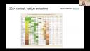
Oops, okay. So now I'm going to go to the last table example. This one was by Grant Chalmers, and it's carbon emissions in 2023 for different countries. And what's really neat about this table is it uses color to show patterns basically in the production of clean energy versus dirty energy. So you can kind of see like the relationship, like as countries produce green energy, they tend to produce less of these other kinds of energy. And you'll notice this is pretty similar to a plot. It's a table with a heat map. And I think this also kind of highlights that at a certain point, tables and plots start to overlap a lot. But some of the big values I think of this table is that as an HTML table, you can pull the text out really easily. So you can copy out values and things like that.
All right. So those are three great examples, I would say, of tables in the wild. And some of the things that these contests have surfaced that have been really helpful for thinking about what should a table display library do. I wanted to show it here because for this workshop to really highlight all the things you could do with tables and just how far tables can go.
How to learn Great Tables
All right. So the last piece before we get to Rich is how I would learn about Great Tables today. So I think the previous section I tried to show some of the variety of things you could do with tables. One area I think is really nice is the examples page of Great Tables, which tries to show a range of things you could do with it. I think if I had to learn Great Tables from scratch, I would really focus on that page, which kind of opens up and shows you tables in a progression from simpler to more advanced. There's also a pretty thorough user guide, which we've tried to make easy to navigate. And then we also gave a talk at PyCon announcing Great Tables this year. And that's a good place to learn more about Great Tables and how we tried to sort of explain to a Python audience why table display is really useful and why we ported GT to Python.
And I'm just going to open up really fast and go to the examples page just to show you. So just to illustrate, so here are the examples. And if you click, you can see the code right here. So basically we're going from a simple one with some, these are some row names. So notice the rows set apart from the rest of the data to column spanners, to like grouping rows, and then to more advanced things like putting URLs into tables and formatting things like superscripts. And then we really try to kind of like pull out all the stops, and you'll notice a lot of color and visuals and pieces like that. So this is where I would start today. And I think that's most of what I have for introducing Great Tables.
I guess before we get to Rich, are there any questions? I actually also don't know how to see questions, so that might've been a dumb. See in the chat, or you can just yell it out. Don't be afraid. Maybe we'll just kick it to Rich, and then if questions come in, we can pause and take them up kind of as you go.
Live coding demo: setup
Sounds good. I was going to show the same thing in my browser, only because like once you get past the examples, you might get the next thing, next place you might get to is like the API reference. And so if you look at it, it's huge, right? It's kind of like a little bit, a lot of stuff. But the thing is, we did try to order things and try to sort of piece things out. Like you'll notice a lot of methods here, begin with tab, or begin with fmt for formatting. So we try to at least like bundle up the different methods. So this is a bit scary, but I will run through all this stuff in the actual demo part, which is coming up next. Yeah, but to get this page, you would get to, next to examples is reference. So sooner or later, you'll hit this. Now, the cool thing to know is that in this reference, you'll have live table examples. So you'll have more examples. One more last thing, in case you joined up late, all the workshop materials are in this repo. I'm going to paste it one more time into the chat.
Okay. So speaking of which, I'm going to go to one of the files in there. This is basically the repo in my VS Code project, starting off with like all these code along files. And the first one I'm going to go through is the code along file. So this is the code along file that I'm going to file. And the first one I'm going to go through is just like setting up. So we can install a few things. The things you need to install are Great Tables and one of polars or pandas or both. They're both good to have. But the cool thing about Great Tables is that you could use one or the other. You're not stuck to two polars. You're not stuck to pandas. You can use one or the other. And we made it such that we have examples for both and it just makes sense.
Okay. Let's see here. Just minimize that. Okay. So we start off with this, Great Tables, imports, GT and example. Just for an example, you can also import polars and also the polar selectors. So I'm just going to run this right now inside a Quarto doc. Okay, it ran. The way you know that GT works is you just run capital GT with the data set. Great. So we can see a table on the right. That means like GT, Great Tables, installed successfully. Great. So another thing we could do is have another example here with using polars with it. So polars has conversion functions, like from pandas, and we can use that right now to make sure that that part works. So it makes you just know that, great. So polars works as well. And we can test other things in polars to make sure things are working. This is more like a diagnostics, sort of like QMD, just for getting set up. So once you have stuff like this, you pip installed all these things, you should be pretty much good to go. There's one more thing you could install if you want to make PNGs. So you could install
Building the coffee sales table
Okay, great. Okay, so we go to the first of three different things or different QMDs. And basically going to make that coffee table table that was shown in the presentation. Okay, just great. So we're gonna start with that. We're gonna import a few things. First thing we want to import is polars. And also the polar selectors. I'll show you what that is about. But we'll import that as CS. And there's a few things we need from Great Tables, we need GT, just the entry point for Great Tables. And we'll also use look and style. This is for styling the table. Okay, so more on that a little bit later. I'm gonna run the cell.
Great, clear everything. Okay, so the first thing we're gonna do is import a data set, it's kind of weird, because it's actually a JSON, but it'll just make sense as we go through. Usually, it's going to be CSVs. In this case, we're actually importing from a JSON, which is inside the data folder, right there. Okay, so I'm gonna do that with polars data frame deserialize. It's a JSON file, we're going to specify that's JSON. Then we're going to take a look at to make sure the import. Okay. And it did. So we have some columns. This is our input data. This is gonna be our coffee table. In the end, this is just like the raw data frame in the viewer. It's a bit weird, because we have a list column here. So maybe something you haven't seen, at least on Python, who knows, but it's there. And we have some references to PNG files, these will become icons shortly. So that's what those are for. Okay, and the rest is just like too much sales on coffee equipment.
Okay, so the first thing we're going to do is we're going to use GT and on the coffee sales data and look at the table. Great. I'm just realizing this might be a little bit too small. So I made this just a bit larger like that. Great. So here's our table. So it's an HTML. It's in the interactive viewer in VS code. Everything is good here. Great. So the next thing we're going to do is, basically, we're going to add a title to the table, like we saw in some of the examples. So the way I'm doing it in this workshop is I'm going to uncomment some of these comments, and then incrementally build the table. So we already have like GT table one that's assigned. That's the table. That's what you see on the right. I'm going to use methods now. And the methods are going to be things like, well, but autocomplete, we see them right here. So tab header is the one we want for making a title. So in this case, it's tab header. And we want the title to be, well, in this case, I'll call it coffee equipment. Equipment sales for 2023. Sort of like a fake year for fake data. Okay, so I'm going to run this cell. And it applied to the top. We're going to scroll up to see it. And there it is. That's the title of the table. So we already added one thing with tab header, which is the title.
Great. Okay, so now we're going to do some of the spanner stuff, which is really nice for grouping columns together, things which are columns which are sort of like related to each other. We see here in the, at the top, these column labels are taken from the column names in the data set. So they retain their underscores and all that stuff. They're pretty much the raw column names. But we're going to, for now, just group some columns together. So the two revenue columns can be grouped together. And the same goes for the profit columns. Okay, and they're side by side. So it makes sense. We don't have to resort them or anything like that. Let's do that. So we're going to uncomment this. We have table two. And to do this, we use the tab spanner. It takes two arguments. One is label. First, we're going to do is revenue. So I'm going to call revenue, make a nice label with a capital. And then we need another column. Sorry, it takes another argument called columns. And here's where we specify a list of columns. Okay, cool thing we can do is use CS, which is what we called our column selectors, which is the polar selectors, that is. And we'll use starts with, okay. And then we can just apply a string, what the column name starts with. So in this case, it'll be revenue. Okay, I'm not going to run it yet. I'm going to do another tab spanner. And that'll be for the profit columns. Okay, so that'll also take columns as an argument. And in here, we're going to use CS starts with profit. Great. Okay, so everything's closed off. It looks pretty good syntactically. So I'm going to run this cell. Great. I have to scroll up because it's a big table. And here we are. Now we have revenue above the revenue columns, profit above the profit columns.
I'm not going to change these column names yet. Well, actually, no, I am. Let's do it right now. The problem with changing the column names too early is you might forget what the original column names are. But we can always look at the diagram, look at the columns, for instance, to get a reference on which columns are there. So we're going to just go ahead and chance it. And we're going to do it right now. So the next step will be to use a different method. And this one is called cols label. So cols label. Yeah, I'm very thankful for this autocomplete. It lets me know what's available. As long as you know what to do with the columns, you can confidently use calls and then, you know, find out what the rest is. So it takes an argument called cases, and it wants a dictionary of, like, the column name and then, like, the text to use for the label. So we're essentially relabeling it from its original name to a better name. Okay, so I'm going to do this. I've actually got something I can copy and paste in because this would be rather slow and you have to watch me type for a long time. So I'm just going to paste this in. I'm going to tell you what I'm doing here. So basically, we have these columns, revenue dollars, revenue percent, profit dollars, profit percent, monthly sales. Notice how we're using the same label more than once. Like, we're just duplicating that. That is totally fine. Labels can be duplicated. The IDs for these columns are from their original names. Okay, so that's how we sort of, like, call them essentially. And it makes sense to have, like, amount as a single word because it's going to be underneath the spanner. So we're going to associate, like, the amount with revenue because it's underneath revenue. So better to see it than to just talk about it. So I'm just going to run that. Did it. And now we see that we have revenue above amount percent, profit above amount and percent here. So it makes lots of sense. There's a little bit of a hierarchy here.
Great. Okay, so now we have this table. The top looks really good. Now to deal with, like, the inside, the body of the table. So let's do some formatting. So the first thing that's obvious to me is we want to format the amounts. So, like, they're in dollar values. Okay, so let's do that first. Let's uncomment this. Great. And the thing we'll need is a formatting function. They all begin with fmt and, again, their methods. So dot fmt. In this case, we want to do currency. So I'll format currency values. Has an argument, columns. We want to know what, like, what values and which columns to format. So we're going to use another column selector or polars selector. It's cs. And it's going to be ends with. Okay. In this case, we can sort of see it up here. Everything that ends with dollars is going to be things that we want to format as dollars, as currency. So I'm going to type in dollars here. Great. And as another little tweak, we have lots of arguments inside each of these formatters. In this case, we don't really care about the cents, if there is any sort of, like, you know, like subunits, like cent values. So we can use an argument called use subunits and set that to false. Okay. I'm going to run that right now. Oh, sorry. I mistyped. We'll do it again. Great. Great. So now we can see for two different columns, because we use the polar selectors, it targets these two columns right here and it applies the formatting correctly. No subunits. So basically, it's just a dollar amount without any period and some cents. It's just like, that's false. So that's not there.
Okay. And we also have some percent values. They don't really look like percentages. They look like fractions. So they could easily be made into percentage values. To do that, we just have to use the format percent method. So fmt, we can see a lot of methods. Underscore has quite a few. It's filling up my entire list there. But in this case, we want percent. Okay. All these formatters have the same sort of beginnings, like in terms of arguments. They require columns. And they also could use rows. You can also do a subset of the cells within each of the columns. We're not doing that here, but just so you know, that's one of the arguments that's common to most of these formatters. Okay. So in this case, this will be cs ends with, in this case, pct. We have to scroll back to convince ourselves that is right, but it's not percent. It's just pct. We don't see it here, but we have some reference to the original column names here. Great. So I think that's all we need. Oh, actually, we can make a tweak, again, because all these have arguments, lots of them. The default is two
decimal places. We don't need that level of precision. So we can just choose decimals equals zero. So we just get a percentage value, and it's rounded to a whole number. Okay. I'm running that, and we see that all the values in the percent columns are percentage values from fractions, and even the total row shows 100 percent, because that was probably a one.
Great. Good, good, good. Okay. So now, any questions I missed? Is anybody... Okay. I'm looking in the chat. Nothing really in terms of... Okay. Great. I will just keep on going then. Okay. So we got this table. It's looking pretty good in the middle here.
This is still to be done. This is still a mystery right now, but basically, these will be plots. I didn't want to give away the plot, but that's basically what's going to happen. What we could do right now is we can style this table a little bit. So let's do that.
Styling with tab_style
Let's add a background to the columns pertaining to revenue. In this case, we're just going to style these as going to be a color called Alice Blue. Okay. And we do styling... We can do it one of two ways with tab options, which is... It's not bad, but another way to do it is with tab style, because that lets you be more precise with where you're styling things, rather than searching through a bunch of options and setting some value on a larger place.
So let's try tab style. Okay. So I'm going to use that. And tab style is a bit more complex. It only takes two arguments, but within those two arguments, you could use other helper functions. Let me show you what those arguments are. So the two of them are style. Okay. So we need something in style. That means something in locations. Okay. Let me just explain what these are. So style is what you plan to do with the locations that you target. So location could be cells in the body. It could be cells in the column labels. It could be the title, the column cells or locations. It's up to you. And the style is like basically the style directive. Okay. And the two helper functions we need, we have to scroll way back. We imported them. They are look and style. So look goes with locations, style goes with style. Okay.
So we want an Alice blue background for the columns that pertain to revenue. Okay. We can do that. We're just going to do it in the body. So it's going to be like right here, revenue. So like these cells right here will be Alice blue. So let's define the style. So to do that, we use style dot. We're just going to take on good faith. This is going to work. There we are. We're back. So color will be Alice blue. Okay. Just knowing colors, we can use these color names. There's CSS color names, or we can use hexadecimal color codes. So either way is totally valid for supplying a color. And if you find that the colors have capitals and stuff in them, like you might see on a page, that's totally fine too. Totally fine.
Okay. So comma here. And locations requires the look module. And within that, there's a few things. We're going to use look body because we want to target the cells in the body of the table, which is this area right here. So that takes its own arguments and it takes columns and rows. We're just going to supply columns for this one. Okay. And the columns we want are the columns that start with revenue. So we can do CS starts with, and then the string that starts with is revenue. Okay. So the revenue columns will be the ones that are targeted, basically the body cells in those columns. Okay. We're going to fill those rows, those cells with an Alice blue fill. Let's run this. Okay. Now we can see it. So it ends here. See, it doesn't go into here. You can specify other locations in a list of look calls. But just for the sake of this simple example, we're going to just keep it to the body. Okay. And in a similar vein, we can also supply multiple style calls. Again, in a list, in this argument. We're not doing it here. We're keeping it simple for the first example.
Okay. Now we're going to do something very similar. We're going to add a papaya whip background as a color to the columns pertaining to profit. So we can actually just copy this code here, like so. Paste it down here, sort of change the annotation. In this case, we want the papaya whip. Great. And we want to supply those to the profit columns. Okay. I'm going to scroll back a little bit. We have these two columns profit. So we know that that's correct. Okay. And this didn't change. We're still supplying a fill. We're still supplying it to cells in the body. Great. So now we did it. Okay. So this just sort of better differentiates these columns. You don't have to do it. This is just a style thing. But if you need to do it, this is how you do it.
Text styling and bold rows
Okay. Now we're going to do a bit more styling. In this case, it'll be text styling. We're going to make the text bold in the bottom row. And this will be like basically the totals column right here. This is going to make the text all bold. Okay. So how do we even begin to do that? Okay. Well, let's get rid of this first, just these comments. We know we're going to need tab style. Great. We're going to use the style. And in this case, the style will be style text. Okay. And how do you get bold text? Well, you can read this giant doc string, basically saying it. A little hard to see, but the thing you need is a weight right here in the middle. And we want bold. Okay. So we're going to type that in. Weight bold. Okay. That's the style directive. Now for locations. Okay. So this is a polars data frame. So we can use a polars expression to get to the bottom row. And how do we actually identify what the bottom row really is?
Well, there's probably a better way. But one way is to just do, first we have to, of course, signal loc body. And then in our, we don't want columns because we want to target all the columns. So we can actually leave columns out. We want to target rows instead. Okay. So in all columns, which row are we going to target? So we can do that with an expression. I don't know if you know polars, but a lot of expressions begin with PL call, and then you provide it the column name. So in this case, we'll do product. Okay. Maybe scroll up a little bit. Product is this column. And it has the value total. So we can say that rows with the product column that has a value equal to total should do the trick. Okay. So we don't have columns like before because we're targeting all columns, but we're targeting a subset of rows. And we're saying that the row is identified by this expression. Okay. Let's run it and see if it's right. It is. Okay. Great. So this is bold text now. Okay. All the way across. So this stuff will just be gone later, like this none, these none values. We're going to replace those with something else. But the rest of the stuff is good here in the bottom of the table.
Any questions at all? Because this got a little bit complex fast, especially with this polar stuff. If you're not familiar, I mean, it's good. Don't get me wrong. But if you haven't seen it, it's like, oh, what is this? Luckily, I've been doing a lot of like folders, data wrangling lately to, you know, to migrate some R stuff to Python. And their API docs are just amazing. You kind of have to hunt and peck around and even just look at Stack Overflow. But usually you'll find your answer pretty fast, because there's lots of answers. There's some good docs there.
Nanoplots
Okay. So now we have that. We're going to do three last things. They're actually pretty big things, but they're the finishing touches. The one thing we're going to do is add a column of nanoplots to the monthly revenue column, which is this. As you may have guessed, this data is ready to go because it's in this list format. So it's a little bit conspicuous. So this is like one input form, which is good for nanoplots, just having it like this in a list column. So to do that, we would use the format nanoplot method. Okay. And the argument is there. Columns, like all formulas. Great. And next thing we need is the plot type. So the usual plot type is like a line plot, which goes sort of up and down. It looks like a sparkline, essentially. But for this case, for reasons, we're choosing a different plot type. So there's basically two choices, line or bar. We're going to choose bar. Great. Great. And I think that's all we need for this. I mean, there's many more options, but this is your first real look at this whole thing. So we're not going to go nuts with options on the first nanoplots you see. Let's run this.
Great. Great. These are nanoplots, essentially. So the good thing about it is that all that data, which is just numbers, are evenly spaced values. So in this case, we're presented a different month of sales. And it's kind of small because they're nanoplots. But you can sort of see that as we hover over, we get values, you know, values for each of these things. And we sort of see the trends. Unsurprisingly, cold brew is very popular in the summer months. Espresso machines, you know, sales are, you know, a little bit, you know, stopping, you know, they're a bit jumpy, like they, they're pretty good. That's kind of a cool thing about having plots in your table, you sort of see trends pretty quickly.
That's kind of a cool thing about having plots in your table, you sort of see trends pretty quickly.
Adding images and handling missing values
Great. So that is nanoplots. Now, we have these, you know, references to image files. I'm going to show you where they are. They exist in the image folder. Great. So these correspond to that. So we have a formatting method, which allows you to take image assets on your local system. And you could put them in into the table. So use format image to get that going. Okay, columns, we want the icon column. Okay. And we sort of verify that there we go, icon. Perfect. Okay. And now, it, we have to sort of link these to the actual, like, you know, like, location of the image, like the files themselves. So we actually have a handy path argument, which allows you to specify the path. So in this case, we're in the subfolder colon, we have to go back, and then we have to go into the image folder, then maybe put that in as well. So if we run this, ah, great, we get icons. Wonderful. So each of these products has an icon, which, you know, makes this totally nice. You can sort of get a visual on what's been sold, the sales themselves, and the values, which are precise.
Great. So the last thing that I would work on is basically this right here, the bottom, where you see none values. So we can change those into something totally different, like a different string, or even just nothing at all. So we can use the submissing function. Notice how it's not format missing, it's submissing, because you can use it after a formatter, right? You can use on, the way formatters work is they operate on single cells, and if another format operates on that same cell, it'll just replace the existing. Whereas sub is like a second pass. You could use sub across an entire column, and it would just work on things that, you know, are important to that function or to that method. So in this case, we don't need to specify columns. When you don't specify columns, it implicitly just selects all columns. So we just want to skip across all the columns and just remove, you know, anything that's missing. We'll replace it with missing text, because this is just one line, we're going to do like this. So missing text is the argument. In this case, we just want an empty string. So if we run this, we'll find that anything that said none before is now blank, which makes, you know, the presentation a bit more pleasing, because none values are a little distracting, and you don't really want them in your display table. So that is basically the table that was shown in that presentation that Michael did, and here is live inside of VS Code.
Okay, so that is like the end of the first part. Maybe we'll break for like two, three minutes. Any questions you want to ask, feel free to ask them in the chat. I will definitely answer them, because we take a little break now, and we'll begin again at 3.55. Well, my time. 55 after, and 5.2, and then we'll keep going, but it's good to have a little mental break to digest all this stuff.
Yeah, Michael's asked a very good question in the chat. It's what I want to know. What are you using? Actually, relaxing. The difference between a panda and a polar bear, pretty subtle. Yeah, it's hard. Zoom emoji. I see, now you have to zoom in, yeah. Oh my god, yeah, you're right. Well, if it matters to anybody, I'm really digging polars. I may have said this before. Easy to find answers. I know it's like a, it's very expressive. It's pretty much like anything, if you're coming from Tidyverse especially, most of the Tidyverse stuff is easily findable in terms of what you might do, in terms of like aggregation, even some complex things. It's different, but it's like possible, and I guess it's possible in pandas as well, but I don't know. All I'm saying is I had a lot of like, you know, like, I had a lot of good luck with polars compared to pandas, I think.
One more thing I'm going to throw out there. If you're typing really fast and stuff, and you maybe don't want to type so fast because you think those are just the answers, that I'm typing, all the answers are really inside the z-answers-code-along folder, which basically repeats, I don't want to spoil things for everybody, but it basically repeats the code-along QMDs, but has all the answers, basically all the statements. So, you should be able to run these and get the tables if you run all the cells. So, if you didn't know that, and you were worried, you don't have to be.
Example two: reaction rates table
Oh, okay. So, we're past the time that I said we would start again, so let's start again. So, now we're on to example two of three examples, and I'm going to show you more stuff beyond that, but I want to slow things down a little bit for this next example. So, I'm going to clear this out, and this will be in terms of little extras and niceties in a table.
Okay, another thing I want to say is that Great Tables contains quite a few datasets. They're all in the Great Tables data module, and there's a number of datasets inside there. One thing to note is that all these datasets are, in fact, Pandas dataframes for the time being. So, you might notice that we do a lot of PL from Pandas, and then we convert that to Polars. Okay, this is important to know, because if you just use it straight out the box and then apply Polar stuff, you're going to be like, what? I don't get that. This is a Pandas dataframe. What are you doing? So, that's basically what I do here. So, I'm using Polars almost exclusively throughout this workshop, so I want to convert all these to Polars from Pandas. That's what's happening here.
Okay, and so this table will be a table of reaction rates. If you've ever done, like, gas phase chemistry, you'll probably know what this is. Otherwise, you have no idea, but it's a cool table, and it'll become really nicely styled and probably pretty useful to people in the field. So, let's begin. We're going to import Polars as PL as before, the selectors as well. I'm using CS as my short code for the name. And Great Tables, we're going to import GT and this time MD. We'll get to that soon. Basically, that means markdown. So, we're going to mark some text as markdown text and have Great Tables converted to HTML text. And then finally, the data set, which will be reactions, will be imported. So, let's run this. Great. You don't really see much in the interactive part. You just see this little beginning part, but it all worked.
Now, the next part. I'm going to explain this very lightly. Just what's going on, essentially. So, again, we're importing this data set from the package, converting it to a Polars data frame. We're going to filter, we're going to basically subset to the rows, which are just mercaptan rows in the column compound type. Okay. And then we're going to just select a few columns from the table. Compound name, compound formula, and any columns that end with K298. That's the reaction rate at 298K. Okay. And finally, we're going to do a little thing. We're going to modify. This is a basic mutation with columns. We're going to take the values inside of compound formula and just wrap percent signs around the string values. So, the thing we got to do just for now, I'll show you why, but that's what we're doing here. Okay. So, I'm going to run this, and we're also going to print out the table in its raw form. So, this is the Polars data frame, and we see we just have these columns here. So, columns ending with K298, compound name, and compound formula. Great.
Okay. So, we got that. So, now the next thing we got to do is to get that table into Great Tables. Plus, we'll make a step. Okay. So, we can do it all in one shot. We use the GT class, and we want to put in reactions mini. That's what we called our transformed version of reactions. Next thing to do to make a sub, which is basically a place where row names are put, we would use the row name call. In this case, we want to use the column compound name. Great. So, let's run that and see what that looks like. Great. So, the thing you should notice here is that this column here is a sub. It's offset by this line. There's nothing above it. This would be the stub head label. By default, it's not shown because basically, it's only there if you want it to be there. You use a dedicated tab method for that, tab stub head. We may use that here. Okay.
And so, the thing we're going to do next is add a title to the table to explain what this table really is. So, in that case, what we're going to do is we use the tab header method. In this case, I'm going to use title and I'm going to use gas phase reactions. Selected. Captain. That's spelled right. Captain. Okay. Notice how I use some stars around my captain. I want this to be in bold. But that's Markdown. So, I'm cool with Markdown. And as it turns out, a Great Tables is so long as you use the MD helper function. You just wrap that around this. We had to import it earlier. So, just be mindful if you want to use Markdown, import MD along with GT as well. Great. So, we have that. And now, I believe we can run it. Great. This table is not so long as compared to the last one. So, you can see we don't have to scroll back up. We can sort of see here. The title is there. Our captain is indeed in bold. Life is good. And we have a title now.
Spanners and units notation
Great. So, next directive for us is to group numerical columns with a spanner. And I got some handy dandy text here for the label. It looks a bit weird, but I'll explain what's going on here. Let's just get set up first. So, I'm going to start with the thing that I know we need to use, which is tab spanner because we're making a spanner. Tab spanner. Okay. And there's two arguments here that are important. There's the label and there's columns. So, in this case, label comes first because this is the thing we're going to use to label what's going on. Okay. So, in this case, we want to use this label. So, it's right here. I'm just going to copy it in like so because it's rather error prone to retype that. Why do that? Okay. That's label. And the next thing we're going to do is the columns. Okay. Now, you may have surmised that we want to use, we don't want to type out all these column names. We could. It would just be like this and then column name after column name. We just type them out. But a better way is to use polar selectors. So, let's try that. So, it'd be CS ends with, in this case, because we see that they begin with different things, but they all end with K298. So, let's actually just use that. Okay. It could be even shorter than that, but this does the trick. Okay. It's easy to explain. So, I'm going to run that. Great. Okay. So, the thing I want to explain is what this is. So, we have this label and we have a line break that just goes in. That's great. But we also have like units right here. So, we have something called units notation in Great Tables. It's its own little sort of mini language, but it's meant to be an easy way to insert, you know, unit values into a piece of text in a table.
We set off this entire thing by using double curly braces on each side. And that just says all this stuff in here is in units notation. Now, each piece of a unit is basically just separated by space, like so. And to get these superscripts, you just use, you know, the hat, oh, sorry, the caret, and, you know, some value. It can be a negative number. That's great. In a lot of cases, it is, because these are inline units. You might have negative values for, like, like either centimeters cubed over molecules over seconds for reaction rate, for this type of reaction rate. And some other things to notice is, like, you know, like things like hyphens are expanded. So, we tried to do some typography stuff. So, it looks like proper units that are nicely typeset. And there's much more to explore here. There's documentation inside the define units part of the reference API. So, it gives you examples, gives you pretty much all the rules and lots of examples in the table for you. So, you can go pretty far with this in terms of providing units in a table, which is pretty important in lots of tables. It's important here.
Okay. So, we ran that. It did the thing. It looks really nice. And now we have a nice banner. Great. Now, we want to change the column labels to readability. So, the column names are, these are just the raw column names for our reference, which is nice to have. But we can also see them on the table. So, you're pretty much going to change them all. So, again, I'm going to copy this in because it's a lot to type here in a workshop. But the key thing to know is we need to use calls a little bit for that. There's really only one argument. You don't have to say cases. You can just put in the cases like that. Okay. Well, actually, cases requires a dictionary. So, we're just providing args, essentially, for this part. Okay. Another cool thing to note here is that, well, we're using units notation again. We have to double curly braces. Because we don't want, you know, O and then three right next to it. We want O underscore three. Okay. So, that's what we're doing here. We're saying, like, we want O underscore three and O underscore three again. We're using this. This lets us know that. Treat it a little bit differently. Typeset it so it looks nice. Okay. And we're getting rid of the 298k part because it's redundant. It's basically explained above. Okay. So, I'm going to run this. Okay. Another thing to note is you could actually just zap column labels. We're using empty string here on this. It very safely just gets rid of the column label. Okay. Maybe it's just obvious what that is. So, you don't really need it. Sometimes that's the case. So, that's what we did here.
Okay. Oh, question in the chat was HPLC analysis. Not really. This is more like gas phase, like, chamber stuff where you're reacting, like, these different things, like, OH, ozone, NO3, nitrate radicals, or chlorine atoms in a big chamber, like, a reaction chamber. And you're seeing what the depletion of, like, these different things is. That's the rate of depletion. So, that's what this all describes.
Formatting chemical formulas and numeric values
Okay. So, now, this top part looks really good on the table. The stuff in the table doesn't look as good. So, let's actually, you know, work with that. So, it says right here, what we're going to do is format the chemical formulas, which are right here, to make them look better. Okay. Right now, they look, like, really bad, but they're actually surrounded by percent signs, which denotes another type of notation. There's not that many more notations in Great Tables, but there's one more called chemical or chemistry notation. And it just says anything inside here is a chemical formula or some sort of chemistry thing. And so, format that as such. Okay. And we can do that through a function called format units. Okay. So, it would both do units like this in its notation, but also work with chemistry within the curly braces. Okay. Okay. But since we just have this, it just treats it as chemistry notation. All will be revealed momentarily. Okay. So, in this case, it's actually very easy. We don't need to drop to another line. It's basically just columns. And the column name is compound formula. Great. So, I'm going to run this. And great. This looks much better than before. Like, those percent signs are gone. We actually have, like, numbers which are subscripts, and, you know, like, they look like chemical formulas. So, really good stuff from the simple usage of format units, so long as you have the inputs in the right format.
Okay. Next thing to do is format the numeric values. So, I'll use this to format the numeric values. So, all these values are really small values because they are reaction rates,
which are small numbers in these units. So, they're not really great to show as decimal numbers at all. Much better in scientific notation. So, let's do that.
We have a formatter called format scientific. And in this case, again, there's lots of defaults. We're just going to choose the columns. Okay. We can either, again, choose, you know, like, make a list of all the columns. But the far better way to do it, since we named things so systematically, is to use CS ends with K298. So, I just copied it from elsewhere. I'm going to put it back in here. Great. And now I'm going to run it.
Great. Okay. What we see here is we get values in scientific notation. So, we get some value times 10 to some exponent value, which is great. It's exactly what we want. So, in scientific notation, you know, there's always going to be a number between 1 and 10, or, you know, never 10, but between. And, yeah, this is just, like, the way you would normally see it. So, that's great. One thing that's not great is this entire column full of none values.
It may be good to show, to show that there's nothing really there. But I think in this case, we're just going to get rid of it. And you're probably wondering, how do you get rid of an entire column? Well, there's a whole method for that. And that would be calls hide.
Oh, sorry, hydrogen columns. Let's deal with the non-values first. Okay. So, that's what they're talking about here, what I'm talking about. I wrote this. So, we want to remove those non-values. So, that's easy as well. We've actually did it before in the previous exercise. That's using submissing. And we just use submissing by itself. And what it does is it replaces it with 10 dashes all throughout. Again, we can change this with the missing text argument, which doesn't really show up sometimes. But it's this one right here. We just say missing, just to show that it works here. Yeah, we do that. But I think in this case, it's good to have a default. Kind of looks nice in this context. So, we're going to just leave it as it is. Just a simple submissing call will do this to all the missing values in the table.
Another thing I was talking about earlier, if I got to you too fast, was the hide the entire column. Because now we really see it, we just have an entire column of dashes. And we don't really want that column if it's not so useful. So, we'll just hide that column. So, we do that with the calls hide function. Okay. In this case, it takes the columns argument. And I do want to explicitly state what it is. It's 03A298. Because I just want to hide one column. So, there it is. So, if I run this, my column disappears entirely from display. So, I think about calls hide is that if you hide it, at any point, you can still run an expression on the data that's hidden. It's just not showing the final view. So, it's still kind of there in terms of data manipulation and doing expressions. So, it doesn't actually eliminate the column. It just doesn't render it is what happens.
Styling the table
Okay. Now we have this table. It looks really good. But I think for this example, we want to style it. And we can actually use theming to style the table quickly without going to each and every spot. We can just use, like, a theme to do it quickly. So, there's actually a set of opt methods in the package. I'll just type in opt, and we'll see a number of them here. These are just quick methods. Well, actually, methods that provide quick access to table options. There's a tab options method, which has a plethora of options. But this just brings it up to the front and makes it a bit easier to access things, especially when multiple things are changed at one time. So, it's a way of modifying options in a more convenient manner.
For this case, for styling, we want to use the opt stylize method right there. And we can use that with the defaults. There's two arguments. There's a style, which has a number from one to six. And there's a color option, which takes six different colors, which are described in the docs right here. Okay. So, if you were to use this, you'd probably want to experiment with different colors and style combinations. But in this case, they start with one and blue, in terms of style and color. So, we're going to go with that. Okay. And just to show you what these different things do, style three looks like this. And style six looks like this.
Okay. So, it's not bad. It's not bad. It tries to style different things into these different styles. And if you're not satisfied, you can override these with subsequent options, like using tab style or using tab options. Okay. So, that's what we're going with right here, opt stylize with the defaults. Another thing is, this default font is pretty good, but sometimes you might have a change in your font. So, we can actually set a default font for the entire table. And again, we're using an opt method for that. In this case, it's going to be opt table font.
Okay. This allows you to set a font for the entire table. Okay. So, in this case, it takes one argument. I just want to show it to you. There we go. Which is font. Actually, it takes quite a few arguments. We're going to use font in this case. And we're going to use a helper function called system fonts, right there. And within that, we have like a name or a number of font themes, as it were. The best way to sort of see what those are is to either try to get the names right here, which isn't always easy to trigger. I always have trouble. But anyway, the help is pretty good for this. And in this case, I know the name. The name is humanist. Okay. Great. So, this is a font theme. So, the idea here is that, oh, here's another thing. Half on purpose. System fonts is not something that we imported. It's a helper function. So, we're going to go right back to the top. And from Great Tables, we're going to import system fonts. I can run the whole thing again here. And then find my way back. And then that line should run.
Great. So, let me explain a little bit of this. The reason why we use system fonts is that if we're using local fonts, you may not accurately know the font name. Or if you're sharing this table with somebody else, they may not have that font on their system. What the font names or stacks of fonts in system fonts tries to do is just have a name and then choose a family of fonts which exists in different systems. So, basically, it has lots of fallbacks. So, if you're on Linux, you'll have a font for humanist. If you're on Mac, you'll have a font. If you're on a phone viewing this table, there will probably be a font there. So, basically, it's a set of font stacks. And the stack means it's a set of fonts and fallbacks right here. So, I love that this doc string just shows it. So, if you choose old style, you'll use any of these fonts, whichever comes first and is in your system. So, these are tested to be on different systems. Okay. So, it's like a font theme which is resilient to different systems.
So, it's like a font theme which is resilient to different systems.
Okay. In this case, I chose that. The font looks a little bit different. You can experiment with different names, but this one's pretty good. Okay. One more thing we're going to do to make this table just a bit more presentable. These are little tweaks, essentially. We can provide more space between values. We noticed that they're a bit scrunched up to each other. We'll, you know, use a little breathing room. So, we can do that with the opt horizontal padding. Method. Okay. This one does take one argument. I don't want to start there, but go to the top, scale. You need a value between zero and three. In this case, we want more padding. So, we'll choose three, the maximum value, right there.
In that cell. There. So, now you can sort of see the difference. The table's wider and there's more horizontal padding within the cells. So, the top and bottom padding hasn't changed, but the horizontal padding has. I can show you one more thing as a bonus thing. There's also an opt vertical padding. It also takes a scale argument, but in many cases, you want it to be more condensed. So, in that case, you would choose the number between zero and one. So, we're going to try 0.5 to show a more dramatic effect than something a little bit higher. If you run that. Oh, sorry. I typed in the argument wrong. Let's try this again. There we go.
There we are. So, now this table is not very high at all. It's actually scrunched down and widened. So, you can, this is actually a really good option for readability or just fitting a table, you know, on a screen. You might want to be a little bit shorter than what appears in the default. Yeah. So, that's my table, table two. I'm running through, basically, high 0.2 reactions table.
If you have any questions, I'm here to answer them. In the chat, yell it out. Anyway you want to do it, I'll answer. Otherwise, we'll take a five. Come back 25 after the hour. Come back 25 after the hour. Right. Rounding up a little bit. Feel free to ask questions during that time. I'm here for that, but this is just like a little break time.
Q&A
Hey, Rich. We did have a question come in on the Q&A saying, is there a way to center the headers? Sorry if I missed this. Oh, these headers. Yes. You do have a tab style. Yeah. So, what we're going to do there is I'm going to type that out. Actually, I have the table right here. So, let's even just do that right now.
Okay. Great. So, I'm going to copy this as before. Yeah. It's a live demo. So, tab, style. In this case, two arguments as before. Good review. Style would be style, text, and I believe we want alignment. One sec. Autocomplete doesn't always happen, which is, okay, there we go, I think. Let's see here.
Okay. This is a good place to go for the help. I just want to be totally sure until I run it, so I don't run into errors. So, this would be style, text. Okay. Align. Okay. That's what we want. So, align would be center. So, let me show you that. Great. And location would be loc. And again, this is a good sort of thing to go back to, because there's lots of loc methods or functions, you could say. In this case, we want loc column labels, and we want to target all the columns. We'll just leave the arguments out. So, it would be loc column labels. Great. Now I'm going to run this. Oh, yeah, we got printed as well. I'm just going to do that separate style just in case.
There we are. Oh, it didn't happen. One sec. Oh, interesting. That is a little weird to me. That didn't work. Okay.
Yeah. Okay. So, if this is truly a bug, I will file this, but this should be the way to do it. And, yeah, it's a little strange. It's not working. I'm sure there's a good reason, though.
But to the asker, if this is, if you're going to do that, this is how you would reasonably do it. We'll fix this and find out if it's really a problem, or just mind this typing.
I'll ask you one question, Rich. Being that you're in a unique position to have worked on gt tables and now Great Tables for Python, do you have now a preference of one over the other? Any sort of words of wisdom for people that are, you know, maybe wanting to get up to speed in using it? I know how powerful it is just for my own use and how amazing it has been for me, but I'd be glad to hear your words on that. Yeah, right now, because essentially this is a porting exercise or project, you know, it's been sort of like preliminary, I would say, in terms of, you know, what's available. Right now I'm thinking it's very close, it's becoming very close to being something usable, especially for pharma.
One thing that's missing is, in Great Tables, that is, is merging of column text together, sort of like a mutation of, like, multiple columns text, which is adjacent to each other, into, like, one column, sort of like combining text together easily within the API. Once that gets in, which should be pretty soon, hopefully by the end of the year, I would say this is, like, pretty much close to parity in both, you know, both in R and Python. You know, a few things, keys improvement, that's the problem when you have, like, something developed for six years compared to something developed, really, for one year. There's some catching up to do. But I would say, like, they're both really good. Depending on whether you need to use Python or need to use R, you can be pretty happy in both, I would say. It's really just whatever your need is, I think, is what dictates what is better or preferable.
Yeah. I'm glad this doesn't work, but I will, again, get on that and see what's going on.
Also, I want to show you, I shared a little bit in the chat about the Unix notation. You can actually run this method, or, sorry, this function from the package. You can import define units and sort of play with it. And you actually get it in the, you know, interactively printed out like these things. So, you can do cool things like this and that. And, well, you have to do scores first. You can sort of see what is going on and how to define units. And there's many more examples on the page, which I believe is over here. It's a lot harder to find because there's so many of these functions, but define units provides a handy table to show you, like, what you get based on your inputs. And some of these things are pretty reasonable in tables. They define what measurement units you have in lots of columns. Yeah, so that might be handy for that sort of thing. Okay, I think we'll carry on now.
Power generation table example
Move on to the third and final of the examples of the workbooks, or QMDs, as it were. This one's called, this one deals with the generation of a power generation table. And this is the table that Michael demonstrated in his slides as well earlier. And it turns out we have the data for it. We kept it all inside of, we have it there for you inside of data, powergeneration.csv. So, we're going to call that in and use the pandas reader this time to call it in. In this case, we're not doing any, like, manipulation of, we don't need to use pullers. In this case, we're just sticking with pandas. Just trying to do a little bit of each.
So, let's actually clear everything here. Start new, just in case. Run this cell. Okay, and now we imported pandas as pd. And Great Tables, we also imported md style and look. So, we're going to do some styling. Some markdown text will be created. And of course, you need GT to even start in the API. Okay, so, we use pandas read CSV to read this file. And we're going to print it out to the interactive console. And we sort of see right here, we have different power generation districts. And then, like, CO2 intensity. And then, like, values for each of the types of energy used. Okay, this raw table right here.
Great. So, we have that. Of course, we want a Great Tables table. So, we'll use GT to get that data in into that API. Okay, and right away, we can print out the HTML table. It looks much the same, a little bit different. It's just the raw data values unformatted with basically this simple table. Okay, so, the first thing we do here is we're going to add a title to the table, add a title to the table, as we did before. We always start with the title. I mean, I always do, because it seems like the easiest logical first step. So, I'm going to do that right here.
That's going to be tab header. Okay, that's spelled right, like so. And use a title argument or not, because I'm just applying one thing. I have a text right here. I'm just going to take this in. There we are. Now, I run it. I have to scroll, big table, but there it is moving across. So, that's the title of our table. Just so you know, there can also be a subtitle. You can break this up into two lines. Subtitle is a little bit smaller.
What I'm going to do is I'm just going to split this up so I can show you the two pieces right here. There we go. Okay. Not the best example, but it shows that you can have two lines right there at the top when title is more prominent than the subtitle. Just going to bring it back.
Great. Now, one thing we can do, and we haven't done this yet in any of our examples, is to add source notes to the bottom of the table. So, we've done stuff to the header of the table, but not so much anything to the footer of the table. So, we can do that with a method called tab source note. There we are. And so, in this case, we want to supply a pretty big chunk of text. I'm going to copy that in from elsewhere, because it is a lot. So, here it comes. There it is. The cool thing about Python is you can also break up strings like this without commas. You can just provide string line after line, and it just becomes one string. We're going to wrap this entirely in MD, because we have a few links here and a line break, and we want to represent that in our table. Oops. Seems like I have something wrong. Yeah, it's indeed. I'm missing one. There we go. Just like this. That's fine.
Great. Okay. So, at the bottom, we have a link, which you can press and go to that page. Same here. These are active links, and we have a line break and some more text. So, we can add multiple lines, if you want to, to the source notes to the footer of the table. Okay. That's great.
Other things we can do is we can change the width of certain columns. Notice how this is a little bit narrow and forces some line breaks, and we'd rather it be a little bit wider. So, we can change that. So, the way we do that is with the calls with function method, I should say. Great. And, in this case, we're going to do something a little bit fancy. We're going to use a dictionary cases, like so. This will be a dictionary. I'm going to pop in what I want here. Just copy it in, because it's quite a bit of text. Okay. In this case, I'm saying zone is definitely 120px, and then everything within that is not zone is going to be 85px wide. Okay. Great. So, that's a little bit better.
Okay. Great. So, just let you know that column widths can be changed, and a lot of times, you really do want to change them to make them look a little bit better.
Formatting and coloring cells
It's essentially styling, you might say. So, formatting. We're going to do a lot of formatting now. So, anything that's a fractional value in the table will become a percentage, and to do any formatting, we need to have a method that begins with fmt. In this case, it's percentage formatting, so it's going to be format percent. These all take columns, so we'll use columns, and here's a cool thing you do with column selectors, like the polar selectors, which are called cs. You can use numeric. You can target a type of column. In this case, all the values we want to make percentages are numeric, so you might say, what about this? That's not a percentage value. That's going to be an absolute value, but that's okay. We could just use this and then overwrite that with a different formatter. Okay. It's kind of like a shortcut, in a way. So, let's run this. Oh, I didn't. There we go. Things we missed, and because we're using pandas, we can't really do that.
Okay. Let's backtrack a little bit here. Let's import folders as cl. Okay, and then we'll import folders selectors as cs. Okay, great, but now we have to read this as a polar state frame. I'm hoping that just works. It's named the same. Oh, it is. Great. Okay, love that. Okay, now we can go back to the part, which is here, and run everything above, run it all over again, like so, and then run this cell with run cell. Great. Okay, now we're back to something that's working, because we now converted everything to, like this data frame, to a polar state frame, so we can use polar selectors within the Great Tables API. Okay, so we got percentages. That was great. CO2 intensity should not really be a percentage. We can remedy that, though. So, we can say, great. So, you haven't seen this one yet, but it's not too bad. Format integer. Okay, and we got to choose columns.
Okay, in this case, our column actually has, like, a space in it, but it seems like that's not a big deal at all. We can just use it as it is. We can just use it as it is. It's not the usual way of having columns, but it was in the CSV, so we're just dealing with that. Great. So, we see here on our table, these values are now integers, not percentage values, which are multiplied by 100, and it left all these other formatted values alone, because the last formatted rule wins. Essentially, you can format over top earlier formattings, and the last formatting essentially wins. Okay, so our table values look really, really good, because we don't have that many types of data values, percentages, or integers.
The next thing to do to make this wall of data sort of, like, become a little more palatable is to use coloring of cells by their value, and we do that with the data color method. Okay, in this case, we're going to do lots of applications of data color, and I think by the end of it, you'll get a, you'll get a total sense of, like, what you can do with data color. There's only a few variations, but the important thing to do is use the method right here, data color, and if you look at the arguments, there's quite a few. We only need a few, though, for this one. So, we're going to choose which columns are the colorizations going to apply to. In this case, we're just going to start with CO2 intensity. So, we're going to say columns, CO2 intensity. Great, and we're going to supply a palette, and I'll explain, like, what's happening with this palette, why it's used. So, we have this palette right here. I supplied it right here, because it's, you know, this is a lot to remember. So, we're going to color these values according to the range, which is from 0 to 900. I just chose some cutoffs based on the data. This can change, and it's going to run through these values, and we'll see that. So, I'm going to paste this in.
Okay, rather large palette. I mean, it doesn't have to be that big, but it is in this case. Okay, and the domain is basically, like, the data cutoffs, like, what this palette applies to. 900. So, we see here, we don't get to, zero is, like, a little below the smallest value. This is, thankfully, a range from smallest to largest, and the cutoff for our data is 701, but we're choosing a cutoff of 900. Okay, so, it's really hard to, I can't really read hexadecimal colors, so it's better just to show you right here. So, it starts from green. These are, what I think, are green colors, moving towards, like, a yellowish green, more to yellow, and then, like, up to brown. Okay, so, this is signaling more, like, I guess, dirtier energy or something like that. And so, lesser CO2 intensity is more green, and then we get to more brown at the bottom. Okay, and then our cutoffs were, like, 0 to 900. We can tweak this a little bit. We can go to 750, and we get more towards the edge of our palette. If we go too far, like, say, to 700, we see our data goes outside that range, and what we have is an NA color that's being applied to that. We have an argument for that NA color, and these are just, like, flagged as NAs, and true NAs, like, none values, are also going to be part of this group. You can just choose a color for this group, but in this case, we're just going to choose 900 as it was originally, and that'll be our range. Great. Okay, and now we have a bunch of different cells, or a bunch of different columns we're going to use, apply color to. In this case, it'll be everything from hydro to geothermal. Okay, so, I'm going to copy in basically this entire thing, just to get this in a more expedient fashion. Right here, CVGT table 7 we're coming from, and we're going to use data color. Great. A couple of minutes of that, and then close this.
Oh, yeah. There we are. So, having the brackets matching colors, really nice to sort of see that, so you can just know right away that we have is correct. So, in this case, we're applying the same, applying this palette to the range of zero to one, because these are percentages, from the hydro to the geothermal columns, sort of consecutively. Right there. Okay, so let's run this. There. So, we see in this case, if we have higher values, higher percentages,
we start with the green color, and then, oh, we're running from zero to one. Okay, yeah. So, we start with zero is essentially this new color, and as you run towards higher percentage values, like more of the good type of energy, or the clean energy, you get more towards green, which is this color right here at the end.
Great. So, there's a question in the chat. If you have, like, ranges that span non-continuously, can you use separate calls for different ranges to use the same color scheme?
Can you clarify what you mean by non-continuously? Sure, sure. Sorry, Rich. I didn't mean to interrupt. I was just thinking about this from a standpoint of, like, sometimes, you know, in the pharma world, we're sitting there with different value sets of ranges that fall in, good or bad range, you know, and so it's like, how do you, how would you, since they're not sequentially, like, in that same, like, you couldn't go from, like, zero to 100 if you have some that's, like, zero to 10, and other ones that are, like, 250 to 500, like, and you would still want them to fall within that given range so that the color schematic is, the graduation of that is similar. How could you do that, if that makes sense?
Right now, it's very difficult. You would run it multiple times. I explained two different sets of rows would be one way, like, different ranges, so you would target different rows within the columns. The best way, which is not implemented yet, is to supply your own function, where you would just take in values and return a color of the same length of values that are the inputs. That's not really there yet in Great Tables. It's possible in R, in DT, but you can't supply your own colorizing function here. It's only a linear, sort of, like, interpolation type. Gotcha, but no, but that's good to know. You can sort of, yeah, you can sort of fake it a little bit by targeting, you know, like, different rows.
That might not be so bad, because then you can, like, you know, disjunct parts could just be omitted, essentially, but that would take a lot of calls. So, essentially, the thing that we're going to implement soon is to supply your own function to do that. Right, right, that sounds like a great setup. Yeah, yeah, yeah, yeah, yeah, that's a good one, because, like, that is, even in very simple cases, you get to that pretty fast.
Colorizing remaining columns
Okay, so now I'm going to carry on and keep going to the right of the table and colorize more of the columns. So, this table is very specific about how it treats color in the original, so that's why we're doing, sort of, like, moving across and having a different range of colors, or a different set of colors for different ranges. Okay, this is totally, like, pretty much an editorial thing, so that's why it's like this, but it at least gets us to use the mechanics of data color a few times to, sort of, like, let it sink in.
Okay, so data color, we want to specify columns here for table nine. In this case, we just want the biomass column. Okay, so use that. It's proper spelling. In this case, palette is going to be the palette that's above, so we'll grab that, and we specified the range previously, so it's going to be dominating in the range of 0 to 0.3. I'm going to run this, so this is just the biomass column, right? My guess is that it's somewhere in between in terms of, like, goodness of, like, energy consumption, and then we're moving towards things like gas, coal, oil, things like that.
Okay, so that's what we do next. Gas to oil right now. Okay, so data color. So I don't know how many columns of data color this is, but quite a few, at least five. Data color again. Columns in this case will be gas to oil, and the only good way to do that is to really just put them in as a list like this, and then the palette would be the one that's specified like so. Then finally, the domain. We have a domain, so we're going to choose that to be 0 to 1, as we've noted up here. Okay, I'm going to run that, and we see that now right over here.
Great. So the last thing we're doing is we're going to take the remaining cells, commit to all remaining cells, and apply the snow color to them. We can do that a few ways. One easy way is just to cheat a little bit with data color, and not have a color ramp, but just have the same. You need to have at least two values here, but that's good or bad. It's a different story, but you can use the same color, and just interpolate between the same color, essentially just giving you one color. So in the column zone, unknown, hydro discharge and battery discharge, we're going to replace everything with the snow color. Yeah, it's very subtle. You probably can't see it, because I can barely notice it, but it looks a little bit like this. It's a slight change.
Tweaking table appearance
Okay, and now we're going to use a few more things to tweak the table, the appearance just a little bit more. We're going to use causal line to align values to the center. Reason being is that you may just want it that way. I know the conventional wisdom is to always right align values. Sometimes they look pretty good in the center, so that's what we're doing here. So causal line can be used for that. So first thing we choose is the alignment property. In this case, we want center. And the columns, this is essentially, if you're coming from R, this is the polar is everything. He'll call the asterisk in the middle. Okay, so I'm going to run this. Great, so now everything is centered. So the column labels, the values below, they're all centered.
Great, but maybe we just reconsidered for the zone. So the cool thing about this is you could, you know, paint over previous uses of, let's use causal line again. This time align will be left, sort of like going back to where it was, and then columns will just be so. And you can run that. This is just to show that you could run the same method multiple times. You can be much more clever with this. You could subtract away, like, that zone column using a polar's expression. Let's say you didn't know that. You could just do this, right? So multiple ways to do things. So just trying to be a little bit forgiving with the API in that way.
Okay, and now we're going to do the same thing as before with the font stack. We're going to use the humanist one. So to do that, we'll just use opt table font. And the stack, which is the argument here, would be called humanist as before. Run that. Font did change. Looks pretty good. Feel free to experiment with other font stacks or just, like, fonts from Google font because we have that functionality as well.
And finally, I didn't copy this from anywhere else, or I didn't leave this blank. Essentially, this is a number of table options, which allows you to change all sorts of things in the table with tab options. So you can change the padding between data rows, both vertically and horizontally. You can change the font size for the entire table. You can change lots of things, lots of, you know, background colors for different parts of the table. So I'm going to run this entirely, and then we get a smaller table because the text is a bit smaller, and we get some, you know, some background coloring in different parts of the table without having to resort to tab style to do that for something so simple.
And that is really the end of the table, the complete table, and really the end of all the workshop material I have. So feel free to ask any questions you have. I'll be here. Yeah, so I'll just wrap up by saying, if there's no real questions now, going back to my browser, a lot of stuff is here in the Great Tables repo. It's a good entry point for finding out stuff about Great Tables. Right here, this link takes you to the documentation page created by QuartoDoc, by the way. Michael worked on QuartoDoc, and you can create a really nice site with that Python package. And the Get Started Guide is a really great way to get oriented with the package and all the things you can do. It provides lots of examples, lots of usable code right here that can be copied, can be run inside your own, you know, your own notebook, which is great. And we have a dedicated example section, as before. This provides, you know, examples which are, you know, maybe a bit more complex than a Getting Started Guide would normally have. We have a reference section which goes through, top to bottom, all the methods in the package. Pretty much from, like, most important to, you know, maybe less important as we go down the page, clean all the datasets which are in the package. And finally, we have a blog. We post somewhat regularly. We try to be good with posting. But we try to, like, you know, talk about releases, what we have going on, things like that. So be sure to check that out, if you can.

