
Unlock the Power of DataViz Animation and Interactivity in Quarto - posit::conf(2023)
Presented by Deepsha Menghani Plot animated and interactive visualizations with Plotly and Crosstalk in Quarto using R. In thi sintro to Plotly & Crosstalk in R: Using code examples, learn to integrate dashboard elements into Quarto with animated plots, interactive widgets (checkboxes), and linked plots via brushing. This talk showcases how to use packages, such as Plotly and Crosstalk, to create interactive data visualizations and add dashboard-like elements to Quarto. Using a fun dataset available through the “Richmondway” package, we examine the number of times Roy Kent uses salty language throughout all seasons of ""Ted Lasso."" We illustrate this using animated plots, interactive selection widgets such as checkboxes, and by linking two plots with brushing capabilities. Materials: - Slides: https://deepshamenghani.github.io/posit_plotly_crosstalk/#/title-slide - Code repo: https://github.com/deepshamenghani/posit_plotly_crosstalk - Richmondway data package: https://github.com/deepshamenghani/richmondway - In-Depth Guide to Creating and Publishing an R Data Package (Richmondway) Using Devtools: https://medium.com/p/245b0fd4c359 Presented at Posit Conference, between Sept 19-20 2023, Learn more at posit.co/conference. -------------------------- Talk Track: Quarto (2). Session Code: TALK-1143
image: thumbnail.jpg
Transcript#
This transcript was generated automatically and may contain errors.
So, I'm Deepsha Meghani and today my goal is to be able to answer what is DataViz Animation, Interactivity and Linking? How can you get started with it in your storytelling within Quarto itself? And finally, have fun while we're learning that together.
So there are lots of amazing packages already that you might have heard of. Some I've listed, some I might have missed. But for the length of this talk, I'm going to focus on Plotly and crosstalk. But know that each of those packages have unique strength for the need that you're trying to solve.
But first, I want to talk about Ted Lasso. Ted Lasso is a show on Apple TV, and Apple is not paying me to tell you that. But there is an American football coach that is invited to teach UK-Richmond soccer team, or as the rest of the world calls, real football. And in that, the captain is Roy Ken, sitting on the right-hand side, who absolutely loves to say the word...
He absolutely loves to say the word... Looks like their AI-powered bleeping is working really well. Great job, guys. So he loves to drop the F-bomb. When does he do it? Well, when he's mad, definitely. But really, in every mood if you've seen Ted Lasso, this is his natural mode.
So we want to look at the number of times he drops F-bombs. Now how do I know this? Because I watched the episodes at 2x speed and diligently noted them down, including the gestures, for science.
Animation
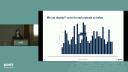
So let's dig into the meat of it. Let's talk about animation. But first, I have a question for you. What season do you think Roy Ken ended up dropping the most number of F-bombs? And whether you've seen the show or not, I do have a hint for you. This is the first episode and how many F-bombs he drops in the very first episode of each season. So season 1, 2, and 3, it's 2, 11, and 6.
So what was I able to do with the animation? I was able to hold the tension in the story while I was bringing you along. And I was able to add a third variable to my story, which is not usually visible in a 2D plot. The third variable here was element of time. It was a season versus count. That's all it was. And I added that element of time where you saw episode by episode. That's what it allowed me to do.
Now let's come to the meat of it. How do you do it? This is where I'm going to talk about Plotly package, where I'm just going to talk about a very simple bar plot. I'm not going to go into how do you prettify the bar plot, because I just want to talk about the basic code structure of animating something. So this is your simple bar plot. You've got a data set. On Plotly, you use a Plotly function, give it the x and y variable, and simply call add bars function. It looks kind of pretty similar to ggplot if you're used to that.
All you need to do to this to make it animated is give it a frame component within your add bars. And what that frame equal to episode tells it is that don't just reveal my bar plot as it is, but build it frame by frame when I click on the play button. That's all that's needed to animate your bar plot. You can also tell it how long to stay on a frame and how quick the transition to the next frame should be.
Interactivity
Now that we've talked about animation, let's move on to interactivity. And this is where we're going to get a little bit technical, because we might bring up some statistic concepts, but I'll hold your hand through it. We're going to talk about Fscore. And some of you stat nerds might already know this, but let's talk about it anyway. An episode's Fscore is how many times Roy Kent drops the F bomb divided by the total number of F bombs in that episode. Or in other words, what's Roy Kent's contribution to that total episode's F bombs?
Now I have another question for you. Which season do you think has the highest number of episodes where Roy Kent's contribution was greater than 50% or his Fscore was greater than 50%? And I have another hint for you. So this is the total count that we saw from the previous animation plot. So which season do you think is the answer?
So I'm just going to reveal the answer. So this is how I could display the bar plot where every single episode, and there could be multiple more seasons, could be plotted in a single bar plot. And you could hover over it, look at the episode and the season that it's from, and look at the Fscore count. Or I could just add a simple thing to make it easier to visualize, where let's just look at season one. So it has two episodes where the Fscore is greater than 50%. Season three has got three episodes with greater than 50%. And season two, one, two, three, four episodes with greater than 50% Fscore. So season two, this time we all are the winners.
Now what was I able to do through interactivity? I was able to turn my Viz into a dashboard-style report. And I know a lot of us have been asking, can that be a dashboard? So this is a great answer for that. And you were able to make your visualization more accessible by adding filtering. You could also add filters like scroll bars, where you just see the Fscore within a certain range.
Now the meat of it, the code structure. I'm not going to dive again into the simple bar plot code structure, but a very quick recap of what that looks like. I am now going to introduce a package, crosstalk. Now crosstalk is exactly what the package name says. It allows you to talk between the checkbox and between the plot. So the first thing you do when you're using a crosstalk package is create a shared data object that would be shared between those two components.
So we created the bar plot on a data set. Instead of doing that, we will create a shared data object from that data set using crosstalk's shared data function. Now once you've created the shared data object, all you do is create the same bar plot that you had created. But instead of using data set, you just use this shared data object. Now what's the other thing you need? You need a checkbox. So crosstalk has a filter checkbox function where you can create a checkbox component. You give it a unique ID. You give it a label, which is a heading you see. You give it the shared data saying that use this shared data object, not any data set. And then the grouping equal to season just tells it, okay, what am I highlighting?
You just place the checkbox and the plot side by side using the BS calls function, and that's it. You have an interactive plot right within your Quarto presentation or Quarto HTML, any type of HTML like your website or document.
Linking plots
Now let's talk about linking. It's another type of interactivity, and a lot of you might know of it as brushing. So I have another question, but we're not going to raise hands. Don't worry this time. At some point throughout the seasons, Roy can start dating their PR manager Kaylee, pictured here. And at some point, he starts coaching the team. So I wanted to find out whether when he was dating, did he mellow down and the average F score go down maybe, or when he was coaching, did it go up?
So here's the answer. So when he was only dating, the average F score was 43% through those episodes. When he was only coaching, it was 39%. But when he was dating and coaching, the average F score went up to 45%. Now this is fine. I asked a question. I answered the question. Nothing wrong with it. But as Roy Kent said, don't you dare settle for a fine. And I'm wearing that T-shirt as well because I'm channeling my Roy Kent energy.
But as Roy Kent said, don't you dare settle for a fine.
So let's add additional insights to this by linking it to another plot. So on the left-hand side of the plot we just saw, and on the right-hand side, I have the F count of every single episode and every single season. So let's say I wanted to see where he was dating only what are those episodes. So I'm able to highlight that real quick. Now let's say I wanted to see the episodes where he was only coaching. I'm able to highlight that as well. But let's say I want to know that when he was dating and coaching, what are the episodes that drove the F score to higher.
So you can hover over this. Look at the episodes that are highlighted and see what were the F scores that were driving it up. Was it because Roy Kent dropped F bomb too many times? Or was it because the episodes F count was just low in general? So you can drive more insights like this. Now what was I able to do? I was able to add layers to the story that I had started with, and I'm able to give my stakeholders more control to arrive at more insights than what they started with.
Now the code, the structure of how do you create this linking? So again, we're going to start with the crosstalk package to create a shared data object between the two plots. So you've got the shared data object created. The only difference this time is the key that says, okay, dating or coaching flag. So if I select on anything, any episode that has dating and coaching flag as yes, highlight all the episodes simultaneously. That's what this key tells you to do.
Now you'll just create the simple plotly plot that we had talked about. So this first plot is where I'm plotting for the average F score through episodes. And the second plot where I'm just plotting the F count versus each episode. And now you just place them side by side using the subplot command. That's it. You've got a linked plot, which one thing highlights and the other thing is highlighted by it.
You can also give it how do you want the highlighting to work. So plotly has this very neat function called highlight where you can say persistent equal to true means if I highlight something, keep the previous highlight on still. On and off just means if I double click, turn it off. If I click once, turn it on. And the dynamic equal to true means did you see that color bar where I can click on the color and choose what color I want to do highlighting with? That's your dynamic equal to true.
Putting it all together
Now that you have all of these amazing tools for animation, interactivity, linking, let's combine all of it in one plot. In other words, don't do that unless needed. So I'm going to still show an example. So here I wanted to animate F count and F scores side by side and see if the trends over seasons is similar. So I can add animation season over season. I also wanted to give the stakeholders ability to click on a season and just dive into it. And I wanted to see, okay, if an episode has a high F count, does it mean they have a high F score, et cetera.
So there's so much happening here that it gets a bit chaotic when you use too many tools in one place. So if you were planning to make everything animated and interactive, stop. Try to think about how it moves your story forward and how you can use it better. And if you're using it in a better way where it moves your story forward, right within Quarto you're able to add tension to your story. You're able to add a third variable to an otherwise 2D plot. You can turn some simple visualizations into a dashboard style and make it more accessible. You can add layers to your story and finally give your stakeholders more control by putting them in the driver's seat.
And if you're using it in a better way where it moves your story forward, right within Quarto you're able to add tension to your story. You're able to add a third variable to an otherwise 2D plot. You can turn some simple visualizations into a dashboard style and make it more accessible. You can add layers to your story and finally give your stakeholders more control by putting them in the driver's seat.
Now some of the resources I wanted to share was there's a GitHub repo for this presentation where you can look at the code I used to generate, but there's also a package where you can download the data of F counts dropped by Roykin and the entire episode. So feel free to go nuts. And finally, I hope this makes you believe that you can easily get started with it. And that's it. Thank you.
We have one question for you. I guess not directly a Quarto question. So the question is can you put these animations and crosstalk into Shiny apps? Yes. Yes, you can. I will make it a Quarto question. You can also put Shiny in Quarto, which there's some blogs on my website linked at the bottom that you can check out. There's a blog about that as well. But yes, plotly and crosstalk is something you can easily use within Shiny as well.
