
Towards the Next Generation of Shiny UI
Presented by Carson Sievert Create awesome looking and feature rich Shiny dashboards using the bslib R package. Shiny recently celebrated its 10th birthday, and since its birth, has grown tremendously in many areas; however, a hello world Shiny app still looks roughly like it did 10 years ago. The bslib R package helps solve this problem making very easy to apply modern and customizable styling your Shiny apps, R Markdown / Quarto documents, and more. In addition, bslib also provides dashboard-focused UI components like expandable cards, value boxes, sidebar layouts, and more to help you create delightful Shiny dashboards. Materials: - https://rstudio.github.io/bslib/ - https://bslib.shinyapps.io/flights/ Presented at Posit Conference, between Sept 19-20 2023, Learn more at posit.co/conference. -------------------------- Talk Track: Shiny user interfaces. Session Code: TALK-1124

image: thumbnail.jpg
Transcript#
This transcript was generated automatically and may contain errors.
Okay, so I'd like to begin by taking you back to a time when Obama was first inaugurated, Edward Snowden had just fled the country, and Shiny was still in its infancy. The year was 2013, and at the time, folks were absolutely thrilled to be creating reactive web applications in R and thrilled that it looked like this.
Turns out, more than ten years later, you can run that exact same code with the latest Shiny and get basically the same result. There's not a lot of R packages out there that can claim something like this, that you can take the same code that you learned and wrote ten years ago and run it today and you get the same result.
But let me step back and ask, is this a feature, or is it a bug? It's maybe somewhere in between in the sense that this is really great if you value reproducibility and stability, that you can have a certain level of confidence that the code that you're writing today or the code you wrote ten years ago, we're going to put in a lot of effort to make sure that that code is going to work in the future, that you can deploy the same application and count on that still working.
But on the other hand, for someone just getting started with Shiny today in 2023, this is not a delightful experience. Unfortunately, a lot of people are still encountering the same sort of hello world code that was designed and created for a world in 2013, and it's just something that we haven't put on the top of our priority list for kind of bringing this first getting started experience into the next generation of Shiny UI.
But on the other hand, for someone just getting started with Shiny today in 2023, this is not a delightful experience.
And also, to be fair, it's not necessarily fair to zero in on the hello world experience of Shiny, because really the thing that makes Shiny so awesome and makes it stand out from maybe other competitors is the really awesome set, the really rich ecosystem of extensions that all of you have built around Shiny.
But the thing about this extension ecosystem and Shiny itself is it turns out that a lot of these tools end up leaning on this popular UI framework called Bootstrap, and they tend to lean on this UI framework to take care of some of the details behind styling and design decisions, and in some cases, functionality for some of these UI components. And if you didn't know, even things like technically outside of the Shiny ecosystem, like maybe R Markdown or Quarto or Packagedown or Bookdown, these projects as well, chances are if you're creating a website through an R package, chances are it's probably using Bootstrap at some level to provide styling and functionality.
And unfortunately, if Shiny were just to upgrade Bootstrap by default, we would force a lot of people into doing a lot of work to update their projects so that they're not left in a broken state. And even if you're not a maintainer of one of these projects, even if you just created a sophisticated Shiny application and you've written some JavaScript or CSS, if we were to upgrade Bootstrap, that would potentially break some of the code that you've written and cause you a lot of work to update.
Now one good example of this is Shiny Dashboard, which not only depends on Bootstrap, but also depends on additional dashboarding dependencies that also build on Bootstrap and haven't done really a great job in recent years of keeping up to date with Bootstrap and making sure that they're not making breaking changes to things that would break an update to Shiny Dashboard, for example.
Introducing bslib
So lately we've been working towards building out a framework that can kind of replace Shiny Dashboard and improve upon it, and making that available through the bslib R package. And even if you haven't already heard of bslib, chances are you've already used it, because it's now a dependency of Shiny and R Markdown and has kind of become a centralized home for Bootstrap assets and logic that we've written that builds on top of Bootstrap, kind of like a central repository for these things to live and be shared across projects.
And you may have already used bslib more directly to upgrade your project to a modern version of Bootstrap, which, among other things, gives you access to really rich, powerful theming tools. But more recently we've been broadening the scope of how we think about bslib to include a library of UI components that are primarily focused on dashboarding, but we also are creating these with in mind that you might want to be able to use these components not only in a dashboard, but maybe in a Quarto document or a Markdown or some other non-Shiny context.
Dashboard walkthrough
So that said, with these components, you can make a great-looking Shiny Dashboard like this one. And these components should feel familiar, both in terms of how you express them and how you interact with them, but are going to look a lot more modern and better by default, but also allow you to go much deeper with styling and their functionality. So let me give you a high-level overview of how I created this dashboard.
First of all, at the top here I have a nav bar at the very top of the page where I have a title and a logo on the left-hand side, but on the right-hand side I have some navigation links that allow me to navigate to different pages in this dashboard. Now we're just going to focus basically on this first page of this dashboard for this talk, but to initialize this UI I can use this page nav bar function from bslib and give it multiple page definitions to get this top-level nav bar with navigation to the different pages.
And page nav bar comes with a sidebar argument where I can just start supplying UI elements to this sidebar, and I get this nice page-level sidebar that's left-aligned with the main content area. And in my case here for this dashboard, I have a lot of controls, so I'm going to group them together with an accordion component. And this accordion component can be used outside of a sidebar, it can be used inside of a sidebar, and we have special awareness of that situation to make it look nice and render flush in the sidebar.
But this is going to help me keep visual proximity amongst related controls, and also help users kind of scan sets of related controls in a way that's a lot better than just dumping dozens of input controls in a sidebar, but give it some nice organization and allow you to scan a little bit better.
So here by default I'm showing you basically input controls for searching for a flight path or flight carriers, but we could also be searching by controls related to flight time and weather. So let me go ahead and open up this section called flight time, which has some input controls inside of it, and then this gives me some histograms, histogram sliders that allow me to filter by departure time and arrival time.
All right, so moving on to the main content area of this dashboard, in this first row I have three different value boxes that's showing me the total number of flights and the average departure delay and the average arrival delay. And here to lay out these value boxes in this single row with basically like three different columns, I can give these value boxes to this layout columns mechanism, which will by default kind of guess that I want to place all three of these in one row in three different columns with their widths divided equally. But of course you can go a lot deeper with this with doing like non-equal width columns and even different widths at different breakpoints of device size.
And here also I've just put icons into these value boxes, but as we'll see later we can also kind of customize what we put into this showcase area is what we call it. All right, in the next row I have two cards. On the left here I'm displaying flight paths, and on the right-hand side I'm showing the average delay by carrier. Again I'm going to use layout columns to give me this kind of equal width column layout, and then supply it to different cards with Plotly outputs. So Plotly is providing the visualization itself, but the layout for the cards and the cards themselves are provided via the bslib package.
All right, and as it turns out, any card can gain the ability to expand to a full screen view by setting this full screen equal to true. It allows a user to come in and when they hover on this card they'll see a little icon to expand this card to a full screen view. So let's go ahead and expand this card to full screen. And this gives me a much better, closer look at these flight paths, the interactive version I could like further zoom in on this globe and turn it around and stuff like that.
But I want to focus on the bslib aspect of this. Notice I have a title here at the top of the card and right aligned next to that I have this informational icon. That somebody could come in and hover on this icon and get more information about what's inside this visualization. And to implement this I'm using bslib's tooltip, which is a pretty general utility that allows you to attach a tooltip to any UI element on any page. But here I'm using it to attach a tooltip to an icon, which in most cases you should probably be attaching tooltips to icons. And then also placing it inside of the card header.
So let's go back to our dashboard and let's zero in on the average delay by carrier. So I have a pretty similar setup here in terms of the bslib components where I have a card and a card title. I also have an icon here up right aligned in the card header. But this icon, instead of a tooltip being attached to it, I'm going to attach a popover. Which conceptually popovers are quite similar to tooltips, but are going to allow you to actually interact with the stuff that goes inside of the tooltip.
So if a user came in and clicked on this icon, they're going to get a popover that looks like this. And for this situation, I've decided to put in a couple input controls that allow me to kind of tweak parameters behind this particular visualization. So in this case, I've put a select input for people to customize what category that I'm going to average over to look at the average delay. So I could switch from carrier to month. And now I get this bar chart by month instead of by carrier, and gives me a better idea of what time of the year to be flying.
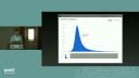
All right, so let's go back to the dashboard, and now let's zero in on the card on the bottom. All right, this is going to give me a better look and a closer look at the distribution of delay times, which is right skewed. But I want to focus in on, again, kind of the upper right-hand portion of this card, and highlight the fact that I actually have navigation links here, similar to how the navigation looks at the very top of the page. So you're going to create this in a pretty similar fashion to how you would create the page-level navigation, but this allows you to basically construct different views for your card using navigation links at the top.
So if you look at the interactive version of this, you'll get a different view of delay times over time. But for sake of this presentation, I'm going to skip over that view. And I'm going to highlight this other icon in the upper right-hand portion of this card, which indicates that we have a right-positioned sidebar that's closed by default. So this is going to give me kind of a nice alternative to popovers, where I can use it in a similar way where I can provide essentially like a drawer of additional input controls that are particular to this visualization that allow me to customize, again, sort of parameters that are specific to what's inside of this card.
So it kind of provides like a nice way for you to scope your controls to subregions of the page versus having just everything dumped into a page-level sidebar. So in this case, I could choose to split up this distribution by weekday. And then this isn't going to tell me a whole lot, but it kind of just shows a pretty stacked histogram where this distribution is now broken up by the day of the week.
Dark mode and theming
So again, going back to our dashboard, there's one last component that I'd like to highlight here, which is this input dark mode, which essentially gives the user ability to toggle dark mode in the dashboard. So let me put that back inside of the nav bar. This is kind of like a standalone component that you could put anywhere on the page, but probably just put it inside of the nav bar at the top. That's where people would expect it to be. And when you click on this toggle, then that will essentially change bootstrap styling defaults to be based on dark mode instead of light mode.
So this is a really nice option for putting some of the theming control in the hands of the user. But also remember with bslib that we have a ton of control over styling defaults available to us inside of our R code. So say I wanted to change up the primary color, bring in a slightly different font, and maybe bring in some different background colors for the value boxes. I could, with a fairly small amount of code, update all of those things to have it look like this.
And a fair amount of that heavy lifting is going to be done through the BS theme function from bslib, which gives you access to like hundreds of different styling or theming defaults provided by bootstrap. So I can do a lot just by setting the primary color to a purple, bring in some Google fonts using this font Google does a lot of work for you in terms of automatically importing font files, downloading them if need be, and actually caching them for future runs. So there's a lot you can do with customizing main colors and fonts with this BS theme. One thing you need to remember is to give this theme object to the page constructor.
And now for a component like value box, we actually give you kind of theming options that are specific to that component, which allows you to like, you know, maybe have one value box that's styled a little bit differently from another value box. But in this case, I'm using this gradient background feature to make all three of these value boxes have like this nice gradient background.
Another nice thing about working in bslib that you might not notice right away is the fact that by default, you're not going to have this awkward empty space at the bottom of your main content region. And this is because bslib gives you a filling layout by default, meaning that on larger displays, outputs will kind of grow to take up any available space in the window. And then as you make the window smaller, those outputs will shrink to basically evenly divide up the available space. Like this. But of course, it also gives you options for opting out of this filling layout feature if you need to.
And this is because bslib gives you a filling layout by default, meaning that on larger displays, outputs will kind of grow to take up any available space in the window.
So if you'd like to play with the interactive version of this app, feel free to screenshot this QR code. I'll give you a link to this bit.ly forward slash bslib flights. If you want, you can search for your flight home. This app has... These are all flights leaving from Chicago in 2022. Should give you an idea of what kind of delay you should be expecting. And also, if you view it on your phone, it'll give you a good sense of how these layouts work pretty well and intelligently on mobile devices as well.
But maybe all don't visit it at once, because maybe I don't know. All right. So to bring everything together, this is just a screen recording of me kind of searching for different flight paths. I have 30 seconds left. I want to step back for just a second and mention there's kind of three common themes that work well in information-rich applications. If you keep in mind overview first, like don't overwhelm your user, give them something high level and useful to take away, then give them tools for zooming and filtering, drilling down into stuff they're interested in, and then getting details on demand through tool tips and popovers. I like this kind of example that kind of does all three at once, where I have a bunch of value boxes with a spark line inside of them. And I can make it full screen and get details. Thank you very much.
