
Introducing Flex Dashboards | RStudio Webinar - 2016
This is a recording of an RStudio webinar. You can subscribe to receive invitations to future webinars at https://www.rstudio.com/resources/web... . We try to host a couple each month with the goal of furthering the R community's understanding of R and RStudio's capabilities. We are always interested in receiving feedback, so please don't hesitate to comment or reach out with a personal message
image: thumbnail.jpg
Transcript#
This transcript was generated automatically and may contain errors.
Alright, well thank you everyone for attending. This is such a large crowd, I'm very excited. What we're going to look at today is a new package for making dashboards by RStudio called Flex Dashboard. And we could start just by looking at some Flex Dashboards to see what these things are.
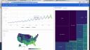
These are all Flex Dashboards. You can see that they're dashboards, primarily visual displays of data. And they're geared to help you very quickly understand or comprehend a data set. If we look at what's in these dashboards, you'll notice there's some ggplot2 graphics. There's some base graphics, although not that many on this page because base graphics aren't as sexy as they could be.
But then there's also interactive things. So for example, here's a Flex Dashboard. It has some HTML widgets based on high charter, which means you can hover over things and read off specific values. There's some lightweight interactivity going on here. Here's another Flex Dashboard that also has this HTML widget based interactivity. It also has Shiny components buried in the dashboard.
So we could, for example, use a drop down menu to select a different city to look at. And the whole dashboard updates. And it's using Shiny in the background to do this. And now we're looking at a different city, we can move a slider and that sort of thing. There's also multiple pages in this dashboard or other dashboards. So we can look at things over time.
What Flex Dashboards are
So the idea here behind Flex Dashboards is pretty simple. It's just a way to display graphics, tables, a little bit of navigation, a little bit of layout organization to create an administrative dashboard for looking at data.
The delivery of Flex Dashboards is the same as any dashboard. It's your portal into a dataset. But on the back end, Flex Dashboards have some things that make it attractive to you, the developer. And those things include, first of all, a Flex Dashboard is created with R Markdown. So if you know how to use R Markdown, you can create Flex Dashboards.
The syntax is the same. And if you don't know how to use R Markdown, Markdown syntax is so easy to learn that by the end of this webinar you'll be able to make your own Flex Dashboards. For the most part. There might be some things I'm not going to repeat about R Markdown here.
Markdown syntax is so easy to learn that by the end of this webinar you'll be able to make your own Flex Dashboards.
The other benefit of using R Markdown is, once you create your Flex Dashboard, it's just an HTML document, an HTML document that was created with R Markdown. And you can use any of the channels that you already use to publish R Markdown documents to publish your Flex Dashboard. So you can put in RPUBs, for example, or maybe RStudio Connect, or even ShinyApps.io to publish your Dashboard and get it out there for other people to see.
What Flex Dashboards do for you
The other thing about Flex Dashboards is that they're going to do some work for you in the background. Flex Dashboards automatically resize the components inside the Dashboard to fit your user's browser window. Or even if your user looks at the Dashboard on a mobile device, it'll do resizing to make sure that the Dashboard looks intelligent on their mobile device as well. So that's all things you don't have to worry about. Flex Dashboard is going to do it for you.
And since Flex Dashboards are R Markdown documents, and since R Markdown can deliver anything that you can create with R, Flex Dashboards can also deliver anything that you create with R. You can make it with R, you can display it in your Dashboard. And that's a wide variety of things. You have your interactive HTML widgets, that's JavaScript-based visualizations. You have your base graphics, last graphics, ggplot2 graphics, put tables in there. And then we'll see that Flex Dashboards even come with some of their own bells and whistles that you can use inside your Dashboards.
And then finally, like we highlighted, Flex Dashboards are Shiny compatible. So if you want to have some deep reactivity in your Dashboard, if you want to provide R scripts and R instructions that your users can trigger just by pushing a button and moving a slider, you can do that. You can really curate their analysis experience inside this Dashboard by combining Flex Dashboards with Shiny.
Given all that, the Flex Dashboard package is actually very simple, and there's not too much for us to cover. What I hope to do here with this webinar is to teach you enough about Flex Dashboards that when the webinar is over, you can go off and make your own Dashboard today.