
Interactive Graphics with Shiny | RStudio Webinar - 2016
This is a recording of an RStudio webinar. You can subscribe to receive invitations to future webinars at https://www.rstudio.com/resources/web... . We try to host a couple each month with the goal of furthering the R community's understanding of R and RStudio's capabilities. We are always interested in receiving feedback, so please don't hesitate to comment or reach out with a personal message
image: thumbnail.jpg
Transcript#
This transcript was generated automatically and may contain errors.
Hi everybody, my name is Winston Chang. I'm a software engineer at RStudio, and today I'm going to be talking about doing interactive graphics with Shiny.
There are a bunch of code examples which you can see at this URL at the bottom on GitHub, and the slides are available there too.
Okay, so here's an overview of what I'm going to talk about today. So first I'm going to talk about different kinds of graphics and what we'd use them for.
So there are static versus interactive graphics. Static graphics are, you know, the traditional plots that you would see. You might print them out, you can't interact with them. And interactive ones obviously are things that you can interact with by, say, using your mouse.
There are graphics for different purposes. So for example, you might have a graphic for presentation, like if you're creating a report that you want to display to somebody, or for publication. And there's data graphics for exploring your data. So if you're still in the data analysis process or, you know, in the exploratory data analysis phase, and you're trying to learn something about your data, that's another purpose for using a data graphic, as opposed to for presentations.
So after that, I'm going to talk about the nuts and bolts of actually creating interactive graphics with Shiny. And so we'll get into some code. And after that, I'm going to talk about using, creating Shiny gadgets, which are, those are, it's using Shiny for the data exploration phase. And this is a new feature that we've added in Shiny 0.13, which was released a month ago. Oh, and I should also mention that the interactive Oh, and I should also mention that the interactive graphics features were added in the last year.
Static vs interactive graphics
Okay, so if, when we're thinking about data graphics, one question that, well, one issue that's important when thinking about them is, is a graphic static or is it interactive?
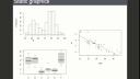
So here are a bunch of static graphics. These are all generated by R. These should all, they probably all look familiar to you.
So one of the most basic things you do in R is to create, to create visualizations like this. So up here, we have a histogram created by the hist function. Here we have a scatter plot created by the plot function with a, well, this one actually also has a linear regression, a line edit as well. And then over here, we have a box plot.
And these graphics in R, these are all part of the database R package. And they're all here, I mean, they're all static. It's sort of the way that things evolved. Before R existed, these types of graphics existed. And they were targeted towards, probably mostly towards print publication or printing out, creating printouts for reports. And back a long time ago, people drew these out by hand. And then after, once computers came around and were able to generate some of these, they were, they could generate these figures, but they were still meant for printing on paper. And they tended to not have a lot of interactive features. So that's sort of the heritage of these types of plots.
So more recently, there have been interactive graphical systems like this. This is a screenshot. This is actually two screenshots of a program called GGOBI, which allows one to interact with the data and explore it. So all of these plots are linked in this example. This is not a live example. This is a screenshot. But it lets you take a look at the subset of this data. So like this yellow highlighted region, the data here corresponds to the highlighted bits here, and in these scatter plots, and in these bars here, and then in the second plot on the right, or the second set of plots on the right, there's a larger region that's selected here, and the other corresponding points are highlighted.
So this sort of tool was used for, or is designed for data exploration, when you're still trying to learn something about your data. But it's not targeted toward presentation for, obviously, you can't use this for print output, because you're not going to be able to interact with a printed page. But even sharing this over a computer is difficult, because other people might not have the software, and the software to run the same sort of visualization that you've created here.
Purpose of data graphics
Okay, so a second question which I've hinted at already is, what is the purpose of the graphic? So for a data graphic, you might use them for in the exploratory phase of your data analysis. So here's an example. I'm looking at this histogram of the built-in data set in R. It's about geyser eruptions, Old Faithful. So I run histogram here. It looks like this, and I decide, well, what if I want to look at the histogram in a little bit more detail, with smaller bin size? Well, I can just tweak a parameter, and then it looks like this.
So I've run hist again, with a greater number of breaks, or a greater number of bins, in other words, and then it looked like this. And by tweaking these parameters during the data exploration phase, you might be able to learn something new about the data. But these, you know, it's not, these are not all meant to be shared with other people. This might just, this is just for me to learn something about the data.
Okay, and then once you're done doing your data exploration, and learning about your data, and processing it, you might generate data graphics for presentation. So this is just a page out of a book. It's got these line graphs, and these are meant for, you know, this isn't meant for the data analyst, or the researcher, to learn about the data. This is meant to communicate some findings to readers, in this case, readers of a book. It could be, you know, a print article, or just, you know, a report, printed report, or something that's on a web page, dashboard, perhaps.
Okay, so state-of-data graphics, about five years ago, was that well, you could generate, there's tools for generating static graphics for the data exploration phase, and this is a screenshot of, that we saw before, but there's plenty of other tools. I mean, even, you know, Excel can generate static graphics that you can use for data exploration. Those same graphics, once you finish your data analysis, they could be used for presentation. Maybe you tweak them to look a little bit nicer, but they're essentially the same thing. And for the data exploration phase, there were interactive tools like GGOBI, which, you know, are good for learning something about your data, but it's more difficult to use them to, for presentation, to communicate those findings to other people, for mostly for technical reasons. But this left us, so there's this quadrant, other quadrant here, that was sort of left unfilled, so interactive graphics for presentation. Well, in the last few years, that's changed quite a bit.
Interactive graphics for presentation
So here are some examples from the New York Times. These are examples of data journalism. They did a really good job with this. And then, you know, there's a lot of other things that have been examples of data journalism. They did a really good job with these.
So here's, these are just two screenshots. I'll show you these live. Get the web browser up here.
Okay, so here's an interactive text, text, well, explore, like, are you receiving a marriage penalty or bonus? So the idea is that in the United States, if you file your taxes as a married couple jointly versus filing separately as two single people, you may end up paying more in taxes or less, even if you have the same amount of income. So, for example, you know, so I just picked this number up here. If you're part of a couple and you earn $81,000 here, and all of that is earned by one partner, and the other partner doesn't have any income, then if you file as a married couple, then you save, you pay $5,300 less in taxes.
So, whereas if you're up here where, you know, both partners earn about the same amount, and then if you file as a married couple, then you actually pay more in taxes than you would if you filed single. So this graphic has some basic interactive features, you know, you can hover over it and it'll tell you some information. So if you want to find out, you know, we're a couple and, you know, one person makes this much money and the other person makes this other amount of money, you can get some detailed information about how much of a bonus or penalty you're paying in taxes. And that's something that, you know, that adds a lot to this graphic. If you just see this graphic like this, you know, a lot of that information is there, but it's a little bit harder to interpret and it's harder to find yourself on here.
If you just see this graphic like this, you know, a lot of that information is there, but it's a little bit harder to interpret and it's harder to find yourself on here.
With these various incomes, like on the x-axis here, it's the total income and the y-axis is the percentage split that's earned by each partner. Okay, so that's one.