
Interactive Graphics
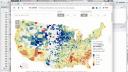
image: thumbnail.jpg
Transcript#
This transcript was generated automatically and may contain errors.
Hi everybody, my name is Winston Chang. I'm a software engineer at RStudio, and today I'm going to be talking about doing interactive graphics with Shiny.
There are a bunch of code examples, which you can see at this URL at the bottom on GitHub, and the slides are available there too.
Okay, so here's an overview of what I'm going to talk about today. So first I'm going to talk about different kinds of graphics and what we'd use them for.
So there are static versus interactive graphics. Static graphics are, you know, the traditional plots that you would see. You might print them out. You can't interact with them, and interactive ones obviously are things that you can interact with by, say, using your mouse.
There are graphics for different purposes. So for example, you might have a graphic for presentation, like if you're creating a report that you want to display to somebody, or for publication. And there's data graphics for exploring your data. So if you're still in the data analysis process or, you know, in the exploratory data analysis phase, and you're trying to learn something about your data, that's another purpose for using a data graphic, as opposed to for presentations.
So after that, I'm going to talk about the nuts and bolts of actually creating interactive graphics with Shiny. So we'll get into some code. And after that, I'm going to talk about using, creating Shiny gadgets, which are, those are, it's using Shiny for the data exploration phase. And this is a new feature that we've added in Shiny 0.13, which was released a month ago. Oh, and I should also mention that the interactive graphics features were added in the last year.
Static vs. interactive graphics
Okay, so when we're thinking about data graphics, one question that, well, one issue that's important when thinking about them is, is the graphic static, or is it interactive? So here are a bunch of static graphics. These are all generated by R. These should all, they probably all look familiar to you.
So one of the most basic things you do in R is to create, to create visualizations like this. So up here, we have a histogram created by the hist function. Here we have a scatter plot created by the plot function with a, well, this one actually also has a linear regression line added as well. And then over here, we have a box plot.
And these graphics in R, these are all part of the base R package. And they're all here, I mean, they're all static. It's sort of the way that things evolved. Before R existed, these types of graphics existed. And they were targeted towards, probably mostly towards print publication, or printing out, creating printouts for reports.
And then, you know, back a long time ago, people drew these out by hand. And then after, once computers came around and were able to generate some of these, they were, they could generate these figures, but they were still meant for printing on paper, and they tended to not have a lot of interactive features. So that's sort of the heritage of these types of plots.
So more recently, this is not like really recent history, but more recently, there have been interactive graphical systems like this. This is a screenshot. This is actually two screenshots of a program called GGOBI, which allows one to interact with the data and explore it. So all of these plots are linked in this example. This is not a live example. This is a screenshot.
But it lets you take a look at the subset of this data. So like this yellow highlighted region, the data here corresponds to the highlighted bits here, and in these scatter plots, and in these bars here, and then in the second plot on the right, or the second set of plots on the right, there's a larger region that's selected here, and the other corresponding points are highlighted.
So this sort of tool was used for, or is designed for data exploration. I mean, you're still trying to learn something about your data, but it's not targeted toward presentation for, obviously, you can't use this for print output, because you're not going to be able to interact with a printed page. But even sharing this over a computer is difficult, because other people might not have the software, and the software to run the same sort of visualization that you've created here.
Purpose of data graphics
Okay, so the second question, which I've hinted at already, is what is the purpose of the graphic? So for a data graphic, you might use them for in the exploratory phase of your data analysis. So here's an example. I'm looking at this histogram of the built-in data set in R. It's about geyser eruptions, Old Faithful. So I run histogram here.
It looks like this, and I decide, well, what if I want to look at the histogram in a little bit more detail with smaller bin size? Well, I can just tweak a parameter, and then it looks like this. So I've run hist again with a greater number of breaks, or a greater number of bins, in other words, and then it looked like this. And, you know, by tweaking these parameters during the data exploration phase, you might be able to learn something new about the data. But these, you know, it's not, these are not all meant to be shared with other people. This might just, this is just for me to learn something about the data.
Okay, and then once you're done doing your data exploration and learning about your data and processing it, you might generate data graphics for presentation. So this is just a page out of a book. It's got these line graphs, and these are meant for, you know, this isn't meant for the data analyst or the researcher to learn about the data. This is meant to communicate some findings to readers, in this case, readers of a book. It could be, you know, a print article, or just, you know, a report, printed report, or something that's on a web page, dashboard perhaps.
Okay, so state of data graphics about five years ago was that, well, you could generate, there's tools for generating static graphics for the data exploration phase, and this is a screenshot of, that we saw before. But there's plenty of other tools. I mean, even, you know, Excel can generate static graphics that you can use for data exploration. Those same graphics, once you finish your data analysis, they could be used for presentation. Maybe you tweak them to look a little bit nicer, but they're essentially the same thing.
And for the data exploration phase, there were interactive tools like Jigobi, which, you know, are good for learning something about your data, but it's more difficult to use them for presentation to communicate those findings to other people, mostly for technical reasons.
But this left us, so there's this quadrant, other quadrant here that was sort of left unfilled. So interactive graphics for presentation. Well, in the last few years, that's changed quite a bit.
Interactive graphics for presentation
So here are some examples from the New York Times. These are examples of data journalism. They do a really good job with these. So here's, these are just two screenshots. I'll show you these live. Get the web browser up here.
Okay. So here's an interactive tax, tax, well, explorer, like, are you receiving a marriage penalty or bonus? So the idea is that in the United States, if you file your taxes as a married couple jointly versus filing separately as two single people, you may end up paying more in taxes or less if you're, even if you have the same amount of income.
So for example, you know, so I just picked this number up here. If you're part of a couple and you earn $81,000 a year, and all of that is earned by one partner and the other partner doesn't have any income, then if you file as a married couple, then you save, you pay $5,300 less in taxes. So whereas if you're up here where, you know, both partners earn about the same amount, and then if you file as a married couple, then you actually pay more in taxes than you would if you filed single.
So this graphic has some basic interactive features. You know, you can hover over it and it'll tell you some information. So if you want to find out, like, you know, we're a couple and, you know, one person makes this much money and the other person makes this other amount of money, you can get some detailed information about how much of a bonus or penalty you're paying in taxes. And that's something that, you know, it adds a lot to this graphic.
Okay, so that's one example. Another example is this interactive map here. This is about, well, the best and worst places to grow up. So if you are, that idea behind this one is if you, depending on where you grew up and your income percentile, there are some places where it's, where if you grow up as an adult, you'll tend to earn more money or you'll tend to earn less money based on where you grew up compared to other places in the nation.
So I live in Minnesota, in Minneapolis, so I'll just zoom in on that. As you can see, well, actually let me back up for a sec. So when you see this large map here, there's all this information here. So there are some parts of the nation where people tend to earn more money when they grow up and some people were, places where they tend to earn less.
So I live up here, upper Midwest, so I guess people tend to earn more money as they when they grow up here. But it's, again, it's a little bit hard to interpret that information just by looking at this map. So the interactive features that this supports is zooming. And then when I zoom in enough, I can see some value, I can see some numbers here. So there's a $700 bonus if you grew up in Hennepin County, where I live, and are in the 25th income percentile. And when I hover over each one, it gives me a little bit more, sort of a detailed text box that gives information, but the same information.
Okay, but this lets you, you know, this interactive map really lets people learn a lot more about the data than they would otherwise be able to just by looking at, just by looking at the zoomed out map.
Okay, but this lets you, you know, this interactive map really lets people learn a lot more about the data than they would otherwise be able to just by looking at, just by looking at the zoomed out map.
Okay, so that's, again, that's something that's pretty new that people are able to do now, which is creating these interactive graphics for presentation. I mean, journalism, data journalism examples are good examples of presentation.
Okay, so here we've filled in all these boxes here now. We've got, so for interactive graphics that are used for presentation, there are the technologies to do that today. So the things that have changed that may have made that possible are, well, there's two really big changes. So one of them is that there's fast networks for sharing visualizations, right? These are not, these are not things that you can share in print. You can't, we can't publish these interactive graphics to a book and expect them to be, still be interactive. So, and this is, you know, the tool, the technology that has made this possible is the internet.
The other change is that there's widespread standardized technologies for, that people interact with, and these are web browsers. So web browsers are everywhere. They're on your phone, they're on computers, they're on everybody's desk. And, you know, web browsers also have existed for a while, just like the internet has, but it's only been recently where there's been a lot of JavaScript libraries for data visualization that can bring those interactive graphics to people in a nice, easy-to-use way.
Tools for creating interactive graphics
Okay, so we've got the same matrix here, but this time I'm sort of looking at a slightly different aspect of it. And what this is showing is what tools can you use to create these things?
So up here for static graphics for both exploration and presentation, you can use R and with an asterisk here. That asterisk is down at the bottom. I say, look, so this is R and data visualization packages like ggplot2 and lattice and a host of other ones as well. Those are just some of the more popular ones. So R asterisk was capable of creating static graphics for both exploration and presentation.
For interactive graphics, that was harder to do previously, but now you can use that same knowledge that you have of R and add some knowledge of Shiny and create interactive graphics for both exploration and for presentation. So probably most of the examples that you've seen, most of the Shiny examples that you've seen are meant for presentation. They're meant to be delivered over the web for people to, you know, for the data analyst creates this and somebody else is consuming the information.
Basic Shiny interactive graphics
So here's a really basic example of that. So this is a, well, this is probably the most basic example that we have of a Shiny application. So this is an interactive graphic where the graphic shows this histogram of the same data that we saw before, but there's a slider that can control the number of bins that are shown in the histogram. So this is an interactive histogram or the number of bars. This is not a live app, so I'll show you the actual thing by running this code in RStudio.
Okay, here we go. So if I move the slider, that histogram updates. But, and this is, you know, from the very beginning, Shiny was able to do this. It had these sort of web form like inputs. This is a slider, which is a little bit more advanced than a typical web form input, but there's also select inputs and text inputs. People could enter numbers and those would influence, those could influence how this plot is displayed.
But this graphic itself is not interactive. So if I click and drag on it, what it's, you can see it's just, it's like I could save this to a file, but I can't actually interact with this part.
Okay, now let me go into the code in a little bit of detail here. Probably if you've used Shiny before, this should all be very familiar, but if you're new to Shiny, then you might learn something from this. So there's two parts. There's a UI code and there's a server code. So in the UI, I define the layout. So I say it's a basic page. There's a plot output that defines a container for this plot to go in. That's called, and it's called it with the name plot and a slider input with the name bins and a bunch of other parameters like the minimum and maximum and a label for it. So that's, that defines it, but that tells Shiny that there should be a slider input here.
Okay, so that's the UI side. That's what shows up in the web. That's what the web browser receives. It's actually just, it is an HTML webpage. On the server side, there is, this is code that executes in an R process on the server. And I tell it that there's an output called the plot output dollar plot. And what should be displayed there is this histogram. It's a histogram of this dataset faithful dollar weighting and the breaks. That's the number of bins is taken from input dollar bins. So that's the input here, slider input called bins. And that matches up with input dollar bins and output dollar plot that matches up with this plot output plot.
Direct plot interactions
Okay. So, all right. So that's, that's like the basic Shiny app. That's the stuff that we've always been able to do in Shiny. Now the new part is these direct interactions with plots.
So let me show you an example. Okay. So with that histogram that we saw, I couldn't do anything. I couldn't click or drag on it or anything like that. With this, with the scatter plot here, I can click on it. And as you can see, there's these X and Y values that show up in the bottom there that correspond to where I clicked. So let's say I want to click at five comma or X value of five and the Y value of 15. That's about right. And you can see that's, that's what, that's what displayed down here.
So this is something, this is, this is something new and being able to click on a plot like this. Now these raw values might not be so useful on their own, but we'll show you what to do with them in a little bit.
Okay. Let's look at the code. So it's really simple. It's, it's, it's very simple to use. So with what we have now is a plot output with the plot. And now I say, click equals plot underscore click. So it's, it's the same as your regular plot output, except you just add this new thing, click equals plot underscore click. That defines a new input value called plot underscore click, and it has X and Y positions.
So up here, I have the render plot and out here, this is the, this is the text. I'm generating the text for the X and that displays the X and Y position. All right. And that's just input dollar plot, click dollar X and Y. That's all there is to it.
But that in and of itself, as I mentioned, might not be super useful because, you know, usually you don't just want the raw coordinate. Let's run this again. Usually you don't just want the raw coordinate. You want to do something with it. Like, for example, select the nearest point. Right.
So in order to do that, there's a function called near points. I'll demonstrate how this, there's a function called near points. I'll demonstrate how this, I'll demonstrate this in action, then I'll talk about the code. So now if I click near a point, it pulls up, what I'm displaying down here is it pulls out a row of data from the dataset. And it's actually, because my line wrapping here is a little bit, the line wrap column is a little bit narrow. It's displaying on two rows, but this is, this is one row out of the data frame with all these different columns. So I click near this point, it displays that. If I click far away, it's not going to, it doesn't display anything. I have to be within five pixels.
Okay. So the code for that looks like this. So, so for the input or the output dollar info, a render print, and to select a row, I use near points, this new function near points. I give it the data object, empty cars, the click input, which is input dollar plot click. And then I tell it which columns out of empty cars I'm using for my X and Y axis. So weight or WT and MPG. And, and like I said, there's a, well, it has to be within five pixels. That's the value I've chosen. The click has to be within five pixels of a point and the maximum number of points it will select is one. That's the maximum number of rows it'll return from the, from that data.
So, and I'll just, I'll demonstrate that briefly. So if I'm clicking right here, there's actually a bunch of, there's actually two points right here that are very close, but because I've said the maximum number of points is one, it'll only return one row out of the data, which is being displayed down there. If I change that max rows to something else, I could, I could have returned more, more rows.
Okay. Now another thing to note is that I did that plot with base R graphics. If you're using ggplot2, you don't need to pass in the X variable and the Y variable names because those are, Shiny knows enough about ggplot2 objects to be able to extract that information automatically.
Adding points and state accumulation
Okay. Now, another thing you might want to do with that. So that's, that's one use of, of, of, of the click information is to select the nearest point. You know, another thing you can do is to add a point to, to a plot or to a dataset.
So, oops, actually, you know what, I should talk about this code first before I demonstrate it. So one thing you might, one way you might do that, you might approach it is by using rbind. So, so in this example, I'm just taking empty cars and pulling out the two columns I'm interested in, weight and mpg. And then I say, if the input dollar plot click is not null, so if there's some, if there was a click, somebody had clicked on something, then rbind a new row to that data frame with the X and Y positions, and then plot that.
Okay. So, so this is, this is a first pass approach at this. And if I were to run this, now, this might not come out very well in this, in this webinar, but if I click on this, you can see a point appears briefly and then it disappears. So, well, why is that? That's kind of weird. That's not very useful. I'm not actually adding a point to my data. Well, maybe I am, but it only lasts for a moment.
Well, we can take a look at this code. The problem is, is that when I click, it sets this input dollar plot click to a non-null value. So it, that tells this whole render plot to re-execute and then it enters into this if statement and it rbinds the data successfully and it plots it. So we do see that point for a moment, but then when the plot is up, the updated plot is sent to the web browser for display, this value for input dollar plot click gets reset. And when that gets reset, because the value changed and that tells the render plot to re-execute. And when it re-executes, this time plot underscore click is null and, and it doesn't enter in this if statement, it just plots empty, like empty cars without any modification. So, so, so we have an issue with reactivity here that we have to deal with.
So the way to deal with that is something that I call state accumulation. So it's this combination of using a reactive values object and the observer event function. So this is a little bit more advanced, but this is, if you're, if you're doing, if you're doing interactive graphics, where you need to record a bunch of events that happen, like a bunch of changes that people make to it, like clicking on, clicking on a plot, you need to, you need to save that information somehow and store it and build it up. And so this is, this is a common way that you would do it.
So it's a combination of reactive values. So here I create something called valves, it's a reactive values object that is similar to the, the input object, actually, of a, of a Shiny application. It behaves, it's the same type of object. So, and there's an item in it called MTC. So when MTC changes, you have, well, valve dollar MTC, similar to when an input value changes that will tell any reactives that use that to re-execute.
So we don't have to worry about the details right now about how that works, but, so we have valves dollar MTC, and then we say observe event, when input dollar plot click changes. That's what this means. Observe event, input dollar plot click means when this changes, execute this code. And what this code does is it overbinds the existing value of MTC and then adds a new, a new row onto that with X and Y positions of the click. And then for the plot, it's very simple. We just, we just plot this valves dollar MTC, dollar weight and MPG.
So if we run this code, let's see, here we go. And now when I click, a new point gets added. So that, this may be useful as well for experimenting with like what would happen if a data point was added here? Like how would, how would a model fit of this change, for example?
Returning values from Shiny apps
All right. Now, this is something that I'll get back to when we talk about gadgets, but it's useful to know right now. So you can have a shiny app. Normally when you deploy a shiny app to a remote server, you don't want the app to exit and return a value. That isn't useful. That would just quit in somebody's web browser. But if you're running it locally, you can actually interact with a shiny app, perhaps with an interactive graphic, and then have it return some value.
Like, for example, when I was adding those points, you could have it return all the new data frame containing all the new points. And to do that, you would add an action button called done or call it whatever you want, but just an action button and then have an observe event. And that's listening on input dollar done. And when somebody clicks on that button, it calls the stop app and then returns a value here. So when you run your shiny app at the R console, you'd say, run app, give it the app, and then save the return value into a variable. And that will take, when the app stops, it returns values.mpc and that gets saved into this variable called value. Okay, but we'll come back to that when we talk about gadgets.
Other plot interactions: hover, double-click, and brushing
So some other interactions, that was just, I showed you clicking. There's some other ones that are useful as well. There's clicking, there's double clicking. And you can see, the way that I use the click option before, as I said, click equals the string plot underscore click. That's actually equivalent to running this from click equals click ops ID equals plot underscore click. This is just a shorthand, the one that we used. So in this double click, I've written it out in a long way. And the reason that the long form is useful is because you can pass other options to it.
So there's also hovering, which is when your mouse moves and rests over a location, it can send that coordinate to the server. So here, in this case, I said hover equals hover ops, give it the ID. And then I set this option delay equals 500. So my mouse has to rest some over a plot for half a second, 500 milliseconds before it sends an updated value to the server. Okay, so I'll demonstrate these.
Okay. All right. So here's my scatter plot. And you could actually see that plot, this input dollar plot hover, it updates when I move the mouse. Let me scroll down a little bit so we can see a little bit more of that. So right now, I'm showing you the entire data structure that's sent from the browser to the R process. So normally, I'd just access x and y. But those are the top two things. But there's all this other information that you can use as well. And if you want to explore this information, you can just run str on these input values, and it'll display this.
So again, the hovering updates when I rest my mouse for a moment. Clicking, I just click the mouse, click it again. The value updates when I click, double click. I double click there, another double click. Okay, so you can use these values for, you can use these different interactions for different purposes.
And there's another type of interaction that's really useful. It's called brushing. So I can select a region, I just click my mouse and dragged it. And this time, instead of just x and y, it's actually giving the x min and x max, this x range and the y min and y max, the y range of this. You can drag this around to update those values, you can resize it. And as it should be pretty obvious, this can be useful for if you want to select a bunch of points, or let's say you want to exclude some points because they're outliers.
You can use it for that as well. Okay, so now let me show you how the brushing works. It's pretty simple. Like the clicking, it's, you just add a new option, brush equals plot underscore brush. And if you want to see the points or the rows of data, or the points that were selected in the brush, you'd say, we have this other function, liken your points, and then you'd say, liken your points, it's called brushed points, we say, brushed points, give it the data object, empty cars, and then give it the brush input. So input dollar plot brush that corresponds with this here.
All right, so that's pretty simple, and I'll demonstrate this. Okay, so here's the plot. Right now there's zeroes are selected. If I brush over those points, you can see there's three rows are selected. Again, I got this funny wrapping here, but there's three rows that are selected. I can move it over to here, and one, two, three, four, five, six, seven, eight points are selected, and it's just, it's printing these out. And you could take these points and do something on them, right? You could hide them, or you could include them in a linear model, or exclude them from a linear model, and so on. That brush points function makes it really simple to figure out which points those are that are selected.
Oh, and there's some other options for the brushing. If you've worked with interactive graphics, or you've designed interactive graphics before, you might know the difference between debouncing and throttling. You can control that here. And if you're running, if you know you're running your application locally, as opposed to over, you know, serving it up across the internet, then you can reduce the delay before, that the brush has to rest before it sends, the browser sends an update to the server. And you can make it, if you're running it locally, if you're running it locally, you can make it more responsive by reducing that value. So, this is, this would update every 30 milliseconds, so that's very fast.
Linked plots and linked zooming
Okay, so, all right, so that's, now another technique that you can use by taking these plot interactions is to link plots. So, in the previous stuff I just showed you, here's how to select data points out of a select, out of a, here's how to select data points that were clicked on or brushed. But we can actually link two plots together, so let me demonstrate an example of that.
Okay, so here I have two plots, and they're connected. These are both scatter plots of the same data set, but they're, this one is plotting the HP and DISP column, and this one is plotting the NPG and the weight column of out of empty cars. Now, if I select a bunch of points with brush, with a brush, it'll highlight them in that second plot there, turns them blue.
All right, so this can, this can be useful for finding connections between the variables in the data. So, there seems to be some general trend as we, of, you know, these points are not, when I select a group here, it's not just simply a random group that's shown in the second plot. There's some connection between these variables.
Okay, so now in this particular example, I don't have the, it's not possible to brush in the second plot and have it update the first plot. That's a bit more code, so I'm just trying to keep it simple for right now.
So, so how does this, how do we do this? Well, in the UI side, we create two plot outputs. One of them is called scatter one, one is called scatter two. The first one has, we give it the brush option, or the brush parameter, and we just name it brush. And on the server side, to generate the first plot, we just say render plot and ggplot with some points. So, this is the code to create a scatter plot. And for the second one, we do a little bit more. We, first, we find, we take the brushed points from empty cars of input dollar brush. You notice that this one is using ggplot2, so I didn't have to specify the x and y variables. I just gave it the data object and the brush, so it's very, very easy to call this. And I save that in a variable called brushed, and then I do a ggplot of the data set, and I add a layer of points. This is the base layer of points, and then I also add another layer of points given with just the brushed data points. So, I say data equals brushed, and then I give it a different color to highlight them. So, that's all it takes to link those plots together that way.
Okay, another useful technique is linked zooming. So, this is, I'll show you an example of this. Okay, this is a line graph, well, it's actually two line graphs of sunspot data going all the way back to about 1750, from about 1750 to probably about 1990 or so.
Now, this is a time series, and this link brushing is a commonly used thing in time series. You may have seen this, like, in stock charts, for example. What I can do is I can, they're showing the same data right now, but I can select a region on the bottom here. So, I'm using the brush here, and just a horizontal direction, and then it displays that subset of data that's brushed up here on top, in this first plot. So, that lets me look at this with a lot more detail. And if this graph wasn't interactive, it would be much more difficult. I mean, you could do this in R, but you'd have to, just from the console by plotting it and zooming in on regions, but it would be a lot more tedious work than it takes to just drag the brush over like that.
Okay, and if I click outside, then the brush disappears, and it resets the first plot. Okay, the way to do this is, I've created two plot outputs, and for the second one, I say brush equals brush ops, ID equals brush, and I give it, I tell it only brush in the X direction. So, previously, you were able to brush in the X and Y directions by dragging a rectangle. This time, you just drag horizontally, and it selects the whole vertical region automatically, right? It displays something in the whole vertical region, right? So, I'm just moving my mouse horizontally, and that whole vertical region is selected.
Okay, now, server-side, for the zoomed-in plot, I just say, well, so, I've got my ggplot defined up here. For the zoomed-in plot, I just say, if the input dollar brush is not null, then take that plot, which I saved in P, and set the X limits. So, that's basically setting the X range for it, to the input dollar brush, dollar X min and X max. And this is with ggplot, and this is with ggplot2. That's the syntax with base graphics. It's similar. It's a little bit different, but it's similar. So, just add that on there with ggplot, and then return the plot, and that's all it takes.
Shiny gadgets
Okay, close that, and moving on. Okay, so, the next big topic that I want to talk about is shiny gadgets.
So, the stuff that we've seen, like, most shiny apps that you see in the gallery are, those are shiny apps that are, they obviously have some interactive features, and whether the graphics themselves are interactive is, you know, sort of a separate question, but those are often meant for presentation. So, for presenting something interesting over the web for somebody else. Now, some of these can be used for data exploration, right? If you're a data analyst, you might create a tool for other people to explore a data set, and so, the line, there's not necessarily a sharp line between data presentation and data exploration, but there's sort of a gradual gradations between that, but now, shiny gadgets, these are things that are meant explicitly for the data exploration phase. They're meant for part of, when you're doing your data analysis, when you're learning about it, and you want to use some interactive graphical tools for exploring your data, that's what shiny gadgets are for, and this is something that was previously not very easy to do in R, but hopefully, with shiny gadgets, we're making it a lot easier.
So, they're new in shiny 0.13, which was released in January, and, yes, again, they make it easy to use interactive graphics for the exploration phase.
Okay, so, let me demonstrate a simple one. Now, this first one I'm going to show you is actually not interactive graphics, but it's a very simple gadget, and it's useful to see this before we get into the graphical part to understand what's going on. So, this is a gadget that asks, prompts somebody to type in their password. Now, this can be useful because in R, well, if you have them type in their password in a function call, it could save it in the R history. So, I got my, in RStudio, you have your history tab here, and it can show you everything that you've typed, and you don't want passwords to be in there, probably.
So, if I say, I typed in my password, abc, clicked done, and as you can see, it returned this value abc. So, I can say, maybe I want to save that in something called, a variable called pw. I'm going to type the password, abcd, done, and then if I type pw, it'll print out that value. So, I've got the password saved in that variable. So, that's what a Shiny gadget is. It runs in this little viewer window here. There's other display modes for it in RStudio. If you're not using RStudio, it'll pop up in a web browser, but it'll have the same functionality. And it's a nice little interactive tool right here that uses Shiny.
But this is not meant for deployment, right? You wouldn't deploy this on a website using Shiny server or shinyapps.io, and you don't want people to click the done button and then have the app exit, because, you know, that's not useful. That would just kill your app on the server.
Okay. So, there's three main differences in how Shiny gadgets operate compared to regular Shiny apps. So, the first is that you invoke it from a function. So, I call that function git underscore password. And that function, it runs the special Shiny app. The special Shiny app has, it uses the mini UI for the layout. That's a new package that we released along with Shiny 0.13. And it's meant especially for laying out Shiny gadgets or other applications in this small constrained space, hence the name mini UI. And finally, when the app exits, or sorry, when somebody clicks on the done button, it calls stop app, and that ends the app, and it returns value to the R console.
Okay. So, let's see. Okay. I'll explain the features here. So, first, as I said, it's invoked from a function, git password. So, I've defined this function here, git password. It's a function that does all this stuff. It defines a UI, server, and then it calls run gadget. Okay. That's a special function for doing gadgets. So, when they call, when the user runs git password, it runs all this code and calls run gadget.
And hopefully, you know, if you're making gadgets for other people to use, they just load this. It could be in a package, for example. They would just have this function, and they don't need to know all the internals of it. They just call git password.
So, for the layout, this stuff is from mini UI. So, there's this function mini page, gadget title bar, and mini content panel. I'll show you how those line up in a little bit. And finally, we have this observe event input dollar done. So, when they click on the done button, it stops the app and returns that input dollar password. Or if they hit the cancel button, then it stops and says no password. And those are things, the gadget title bar automatically has those cancel and done buttons built into it.
Gadget with interactive graphics
Okay. So, here's an example of a gadget with interactive graphics. All right. I'll run this application for this gadget.
I think I have it here. Okay. Now, the inspiration for this one was, I was talking to a friend of mine who's a statistician, and he was showing me something that he had to do in order to exclude outliers from a data set. So, he had a scatter plot like this. And the way that he would do it is, he used R most of the time. So, he would save his data out of R, open it up, load it up in Minitab, and then Minitab has a little graphical thing for excluding outliers from a data set. So, we'd exclude his points, save the result out of Minitab, and then import it back into R. And that was just a pain. So, he showed me this, and I was like, okay, well, I think we can do something that's a lot better. We can keep it all in R and give it a nice interface.
So, scatter plot of that data set. And now, if I click on these points, as you can see, I'm excluding them from what's being used in this linear model. And I can brush points. I can turn those ones back on. I can hide these ones or remove those ones from the model calculation. And I can also change the model, the polynomial degree used in the model. So, this is a quadratic one. I'll turn those points back on. Or I can use a cubic and so on.
So, anyway. So, let's say I toggle some of these points. Again, I do degree two, and then I say I'm done. Well, okay. Let's get that console back so we can see it. See the result here. So, I ran it. LM gadget. That was my function. That's the name of the function that runs that gadget. I saved that output in a variable called M. And I just happened, the way that I wrote this gadget, it returns the data of all the selected data points, all the ones that were not excluded. And it also returns the model object. That's an LM object. And it's got the coefficients, polynomial degree two. So, it's got those two coefficients as well.
okay, well, I think we can do something that's a lot better. We can keep it all in R and give it a nice interface.
Okay. So, with this type of gadget, you can use R for your analysis, for all the great things that R is great for, for all the stuff that you can run with code at the command line. But you can also use it for those times where you need graphical interaction.
Okay. Okay. So, now, as I mentioned before, I would explain how these things, these functions line up to, the UI functions line up to various parts of the interface. So, I called mini page. That defines this whole page here. I say gadget title bar. And that creates a title bar that goes across the top here. And I give it the name interactive LM, which is printed up there. There's a cancel and a done button that are added automatically. And then I add a mini content panel. That's where the basic or the main content goes. And then at the bottom, I add a mini button block, which is a fixed height thing at the bottom that I can add buttons to. I added two buttons, but you can add more or fewer if you like.
And if you've worked with layouts and with regular Shiny code or in HTML and CSS in general, you know that it's hard to keep a fixed height thing. It can be hard to keep fixed height things at the bottom and to have the height of a container scale to the available size. But the mini UI package takes care of all that for you. So, that's the reason it's there.
Okay. This is the code that I use to accumulate the state when somebody clicks on a point or toggles them with a brush. But I think we're running short of time, so I won't go into detail on this.
Wrap-up and resources
Okay. So, to wrap up, well, I talked about static graphics versus interactive graphics. I talked about using graphics for presentation as opposed to exploration. And hopefully, you'll be able to take what you know about R and we already know about R and creating plots in R and add